THEATRE
Theater has been a passion of mine over the years. Thankfully, I’ve had the privilege of combining this love for theater with my creative pursuits in graphic design and photography. From poster design to marketing campaigns, photography, acting, and even directing, I’ve found a way to bring these passions together into what feels like the perfect trifecta of creativity. Below is a collection of some of my favorite projects, showcasing my dedication to bringing performances to life.

BCHS PERFORMING ARTS
Designing individual logos for the BCHS Performing Arts program was such a meaningful project for me. After spending four years in this program, it’s been so rewarding to give back through design. These logos are now featured across playbills, social media, posters, and more — helping represent a program that shaped so much of who I am creatively.
Below are posters, playbills, and photographs I’ve created for this program, highlighting both my passion for the arts and my connection to the community that shaped me.

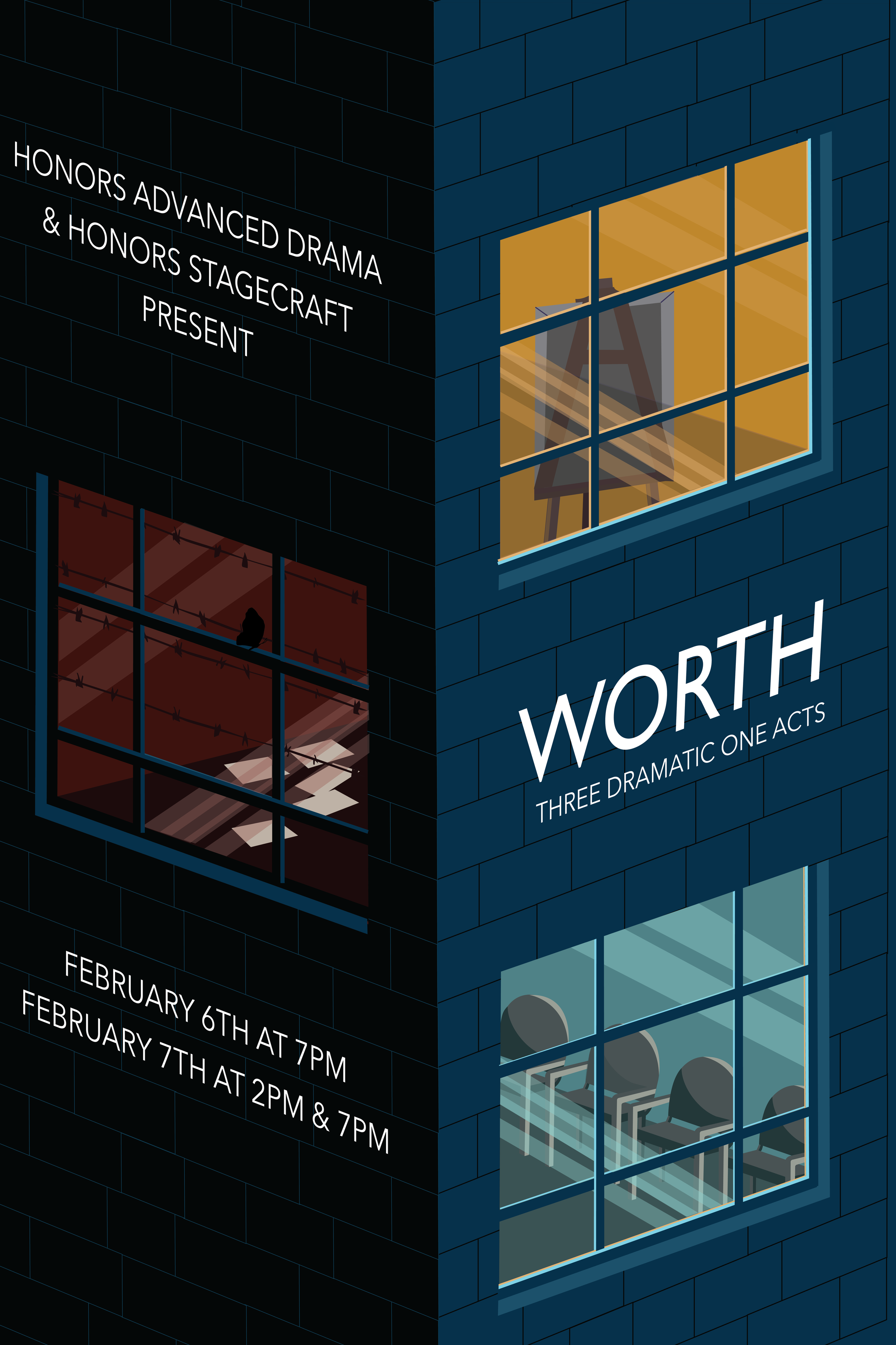

WORTH
THREE DRAMATIC ONE ACTS
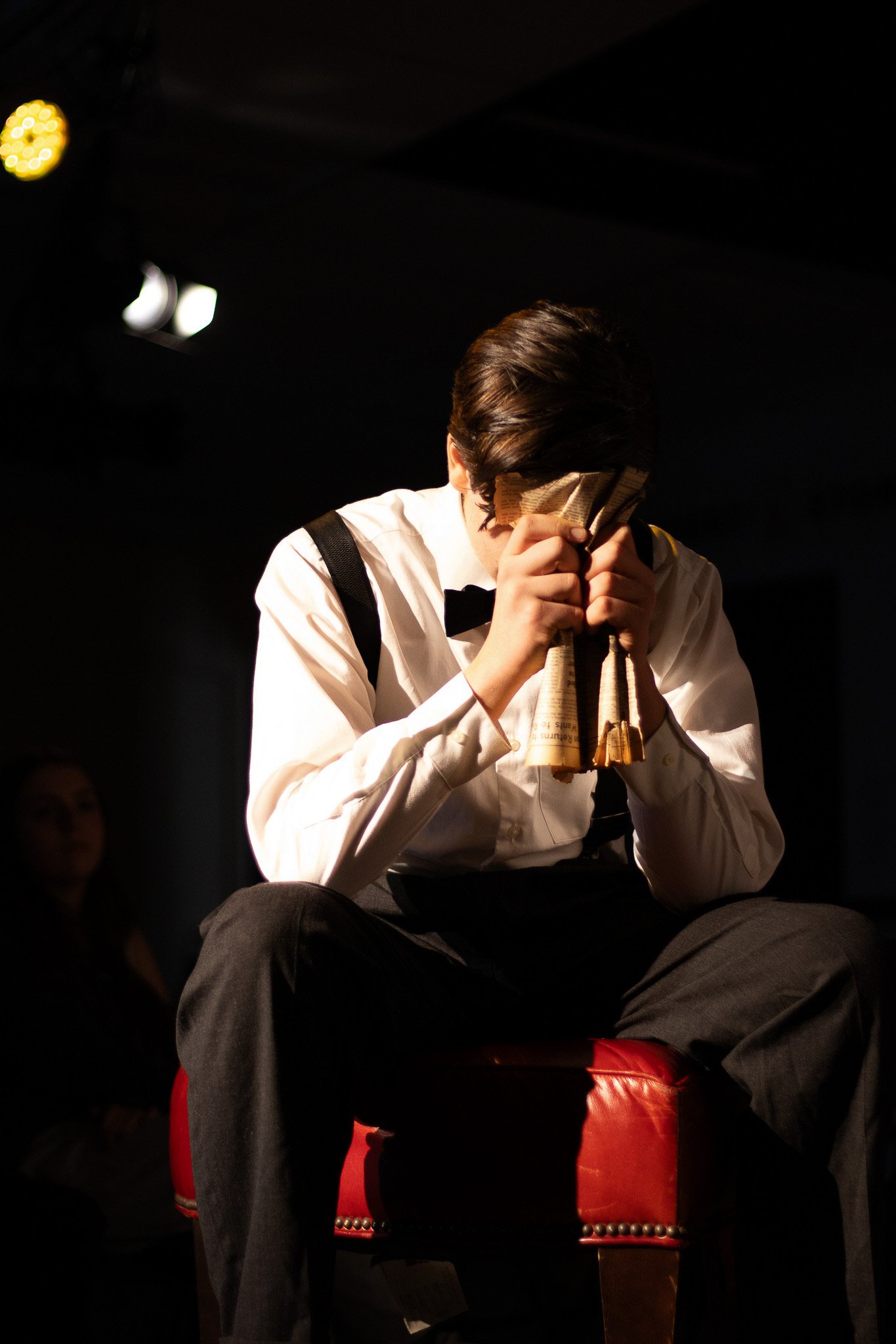
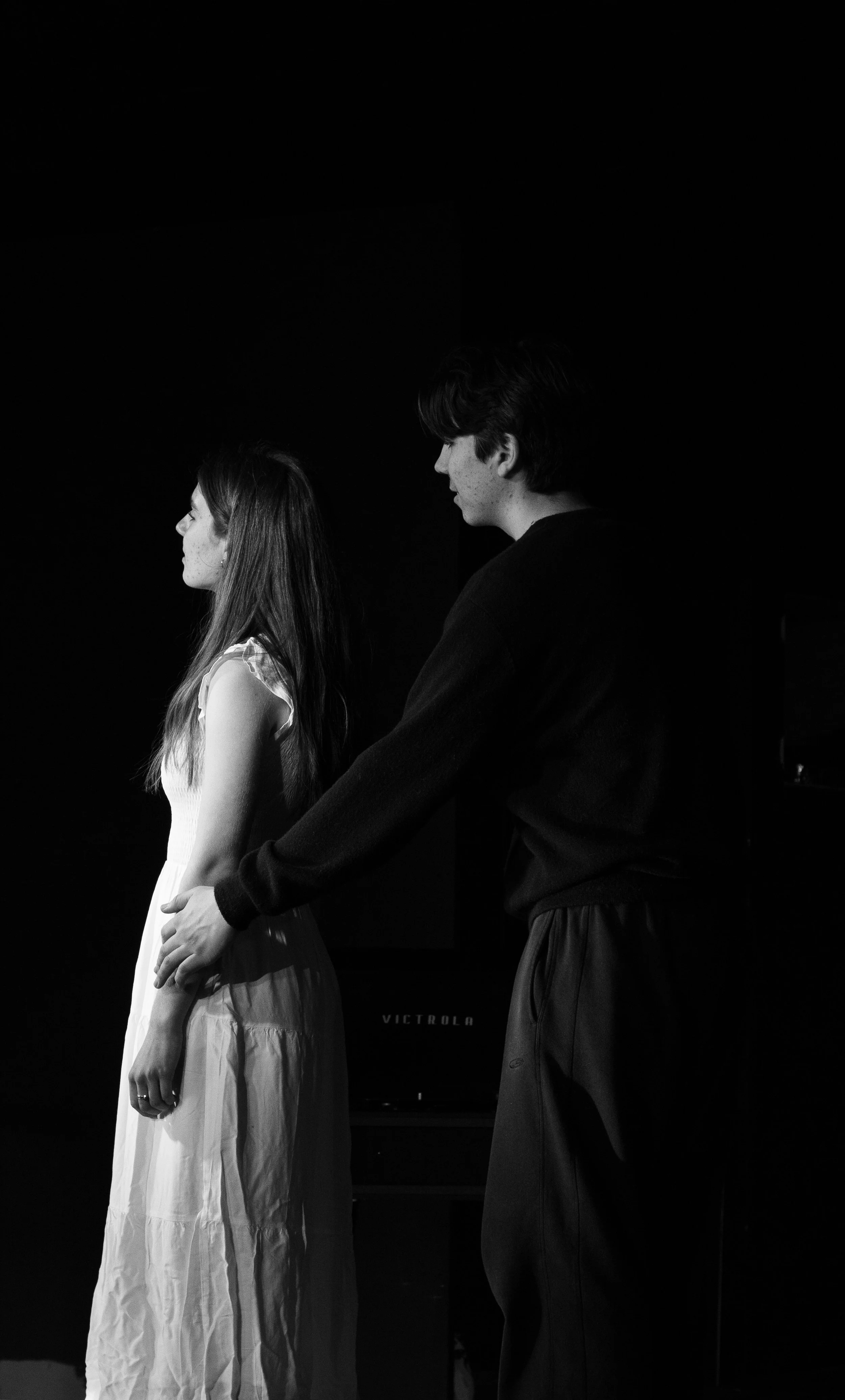
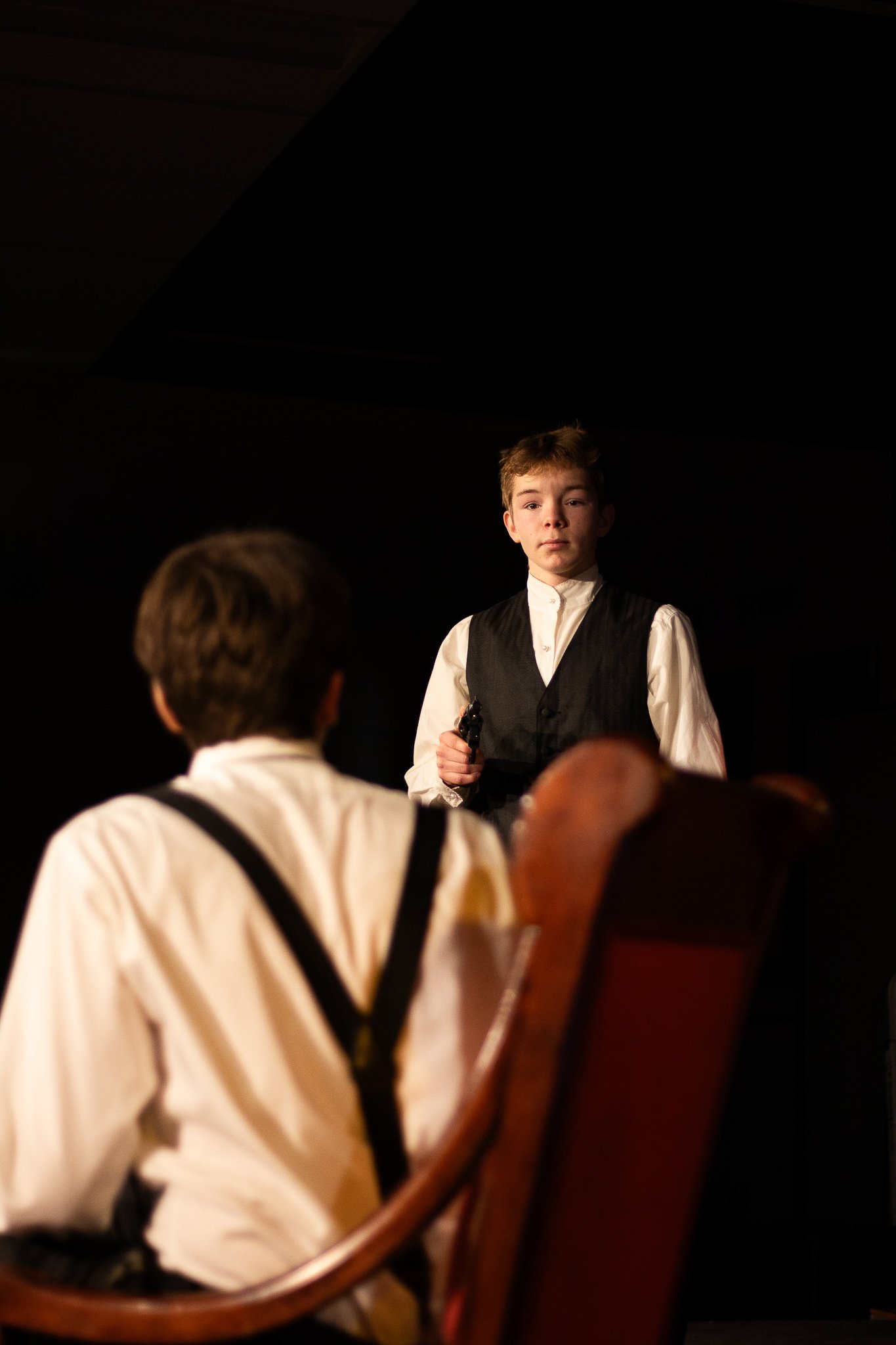
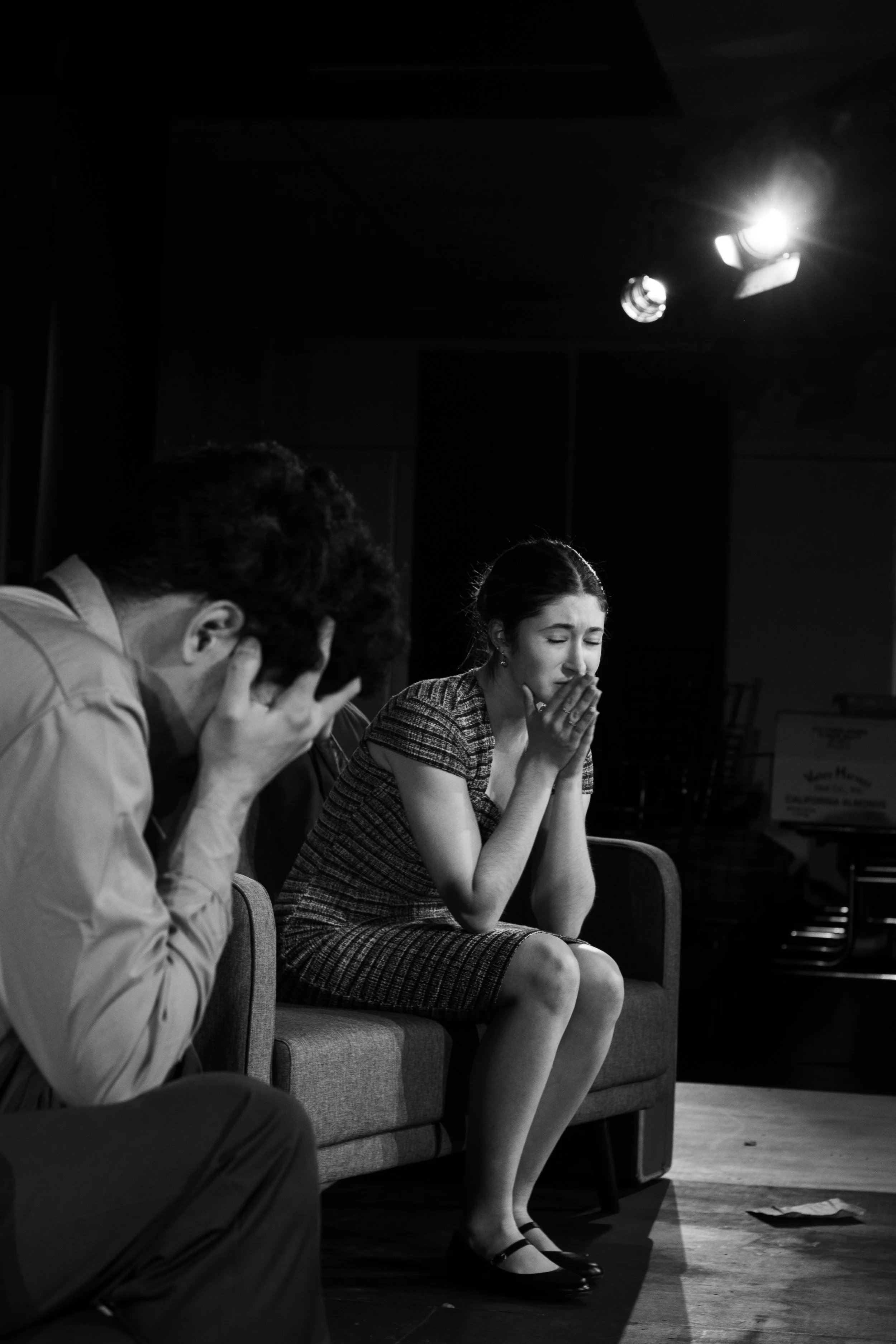
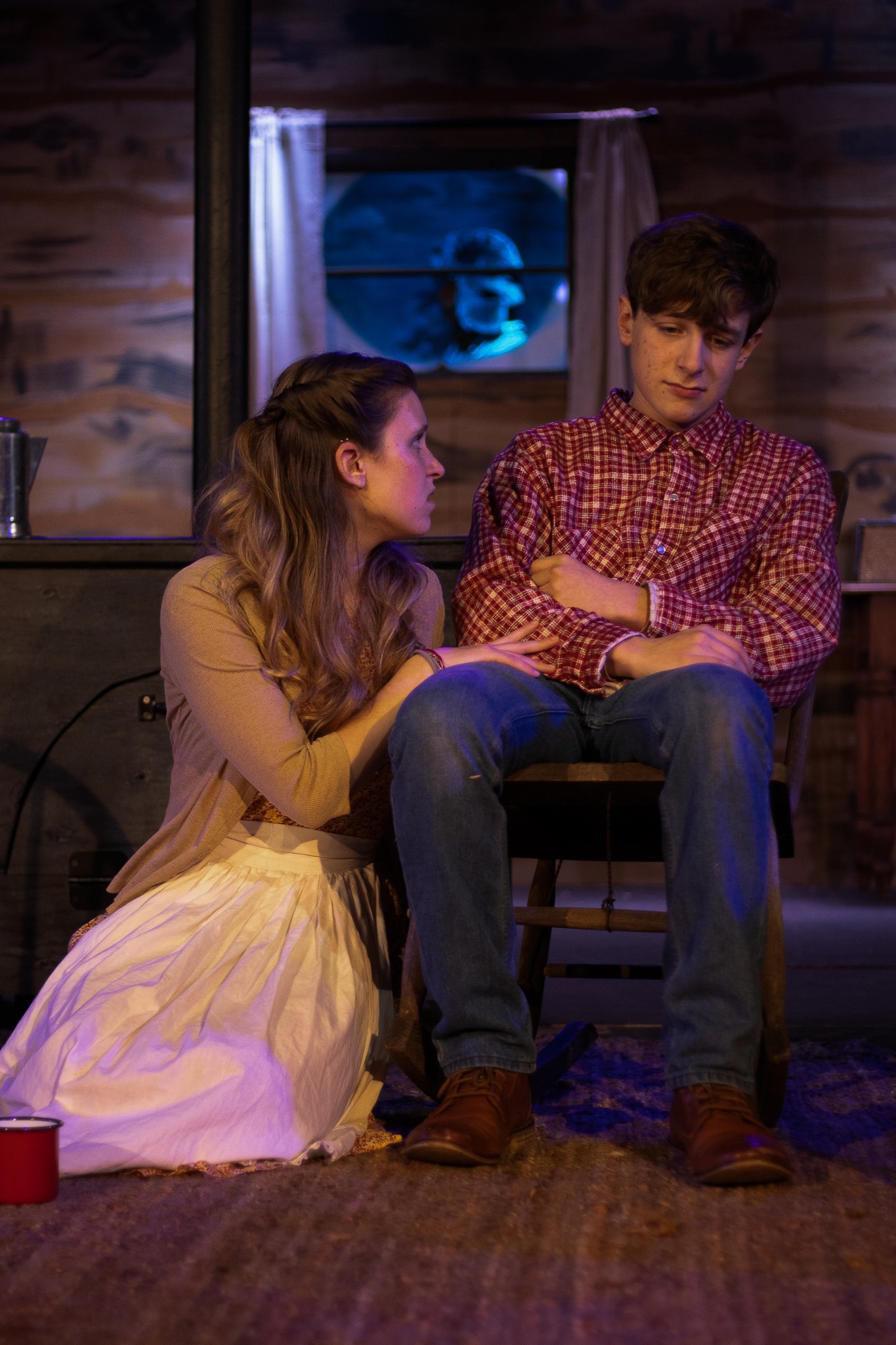
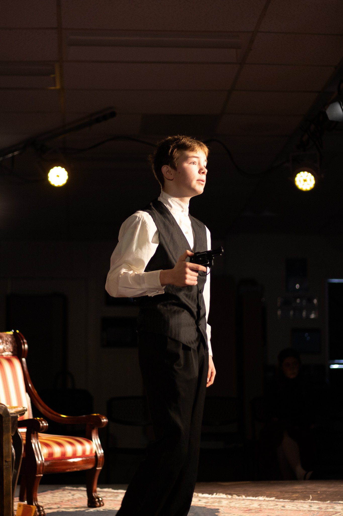
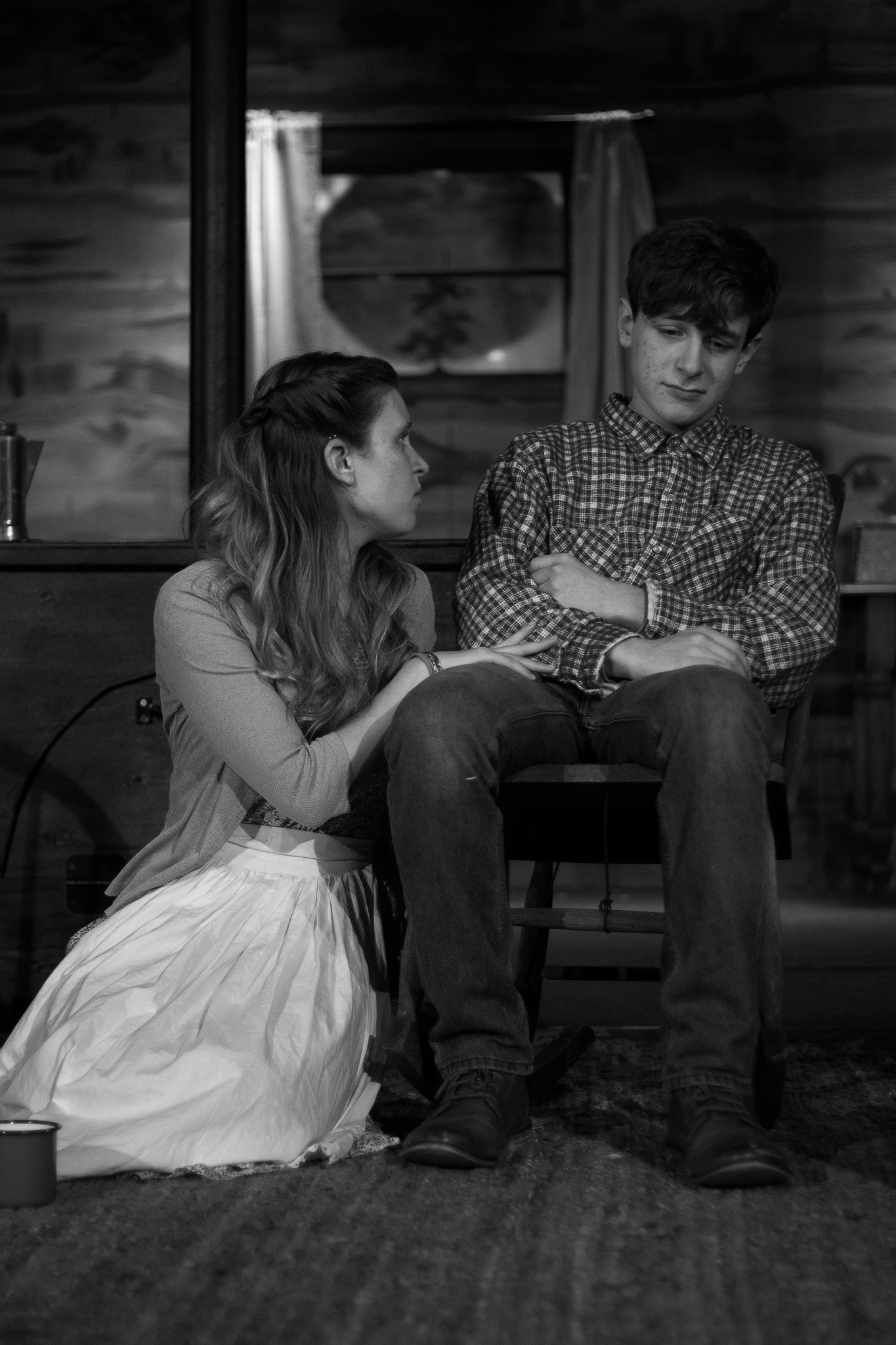
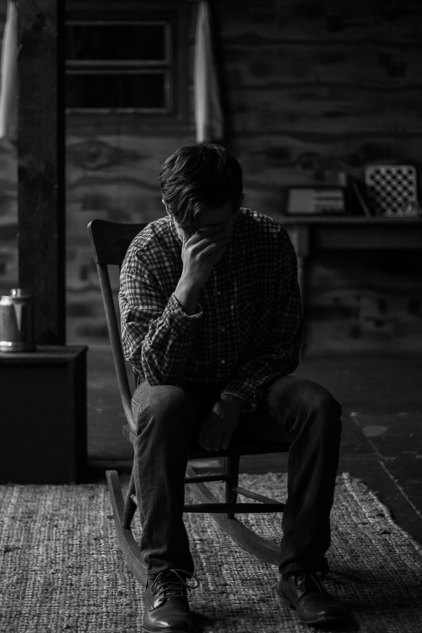
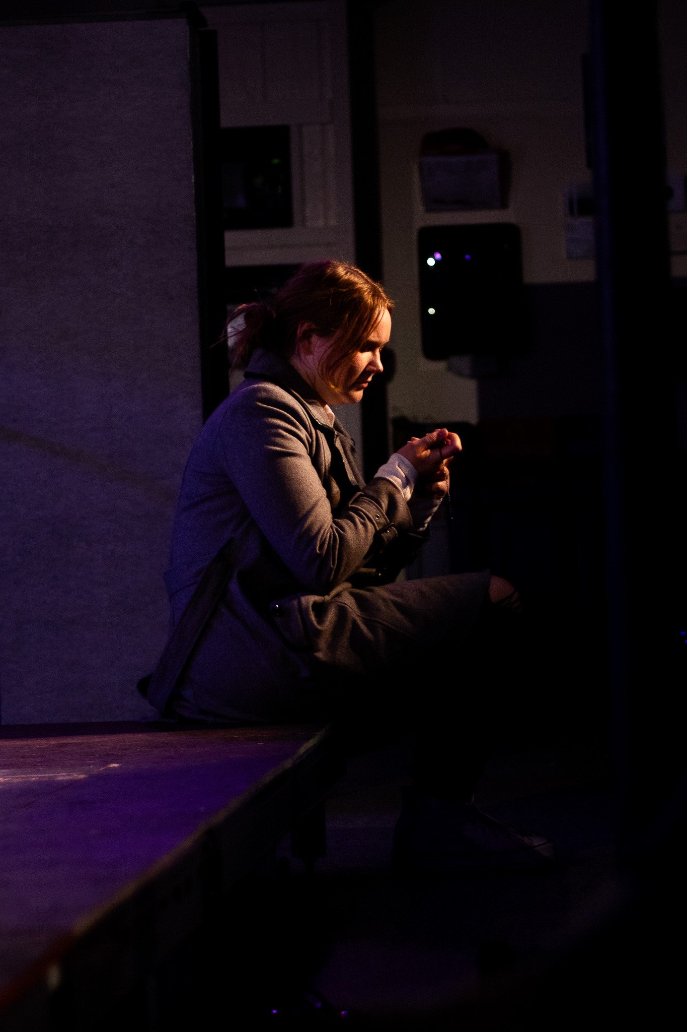
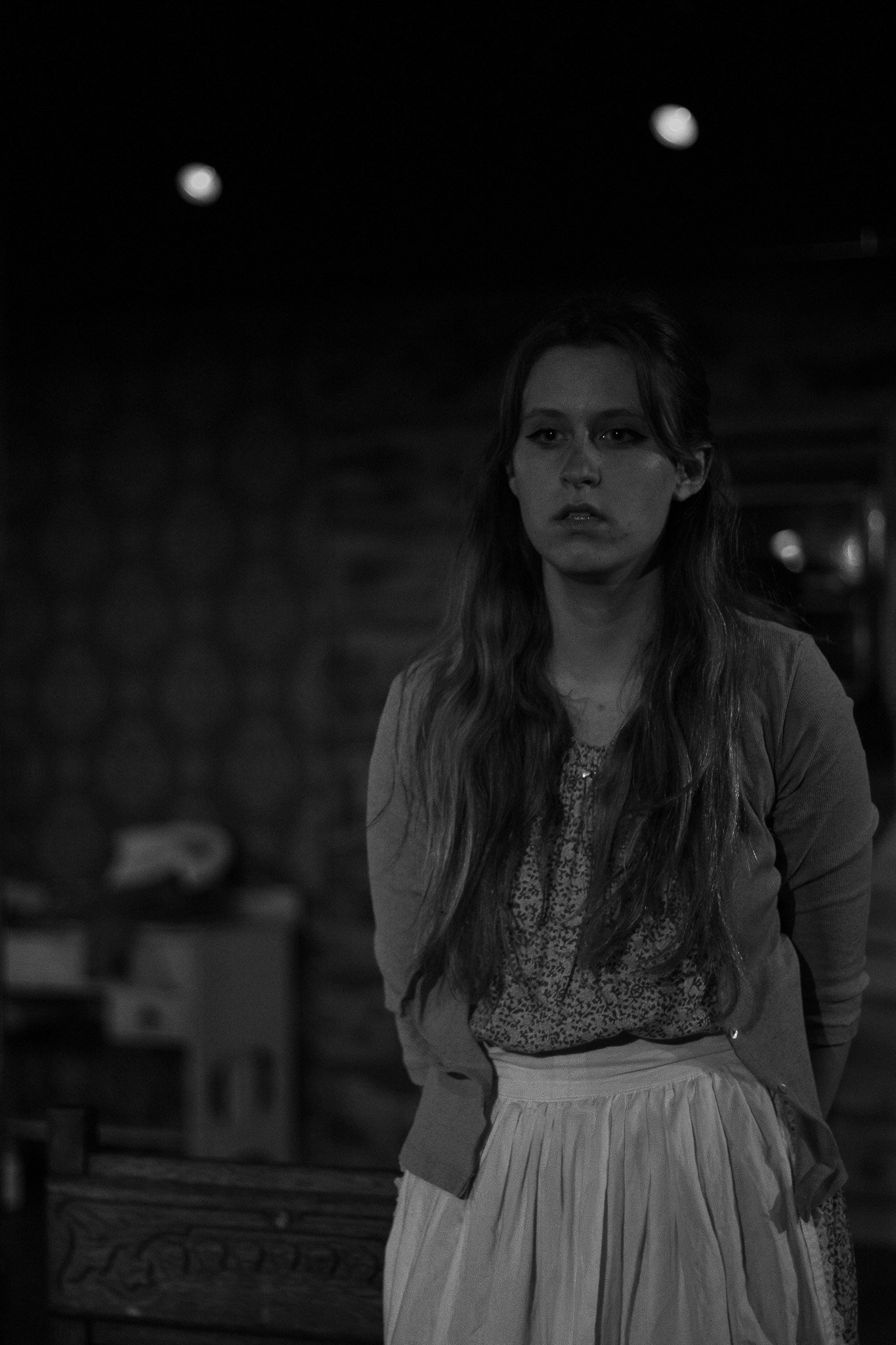
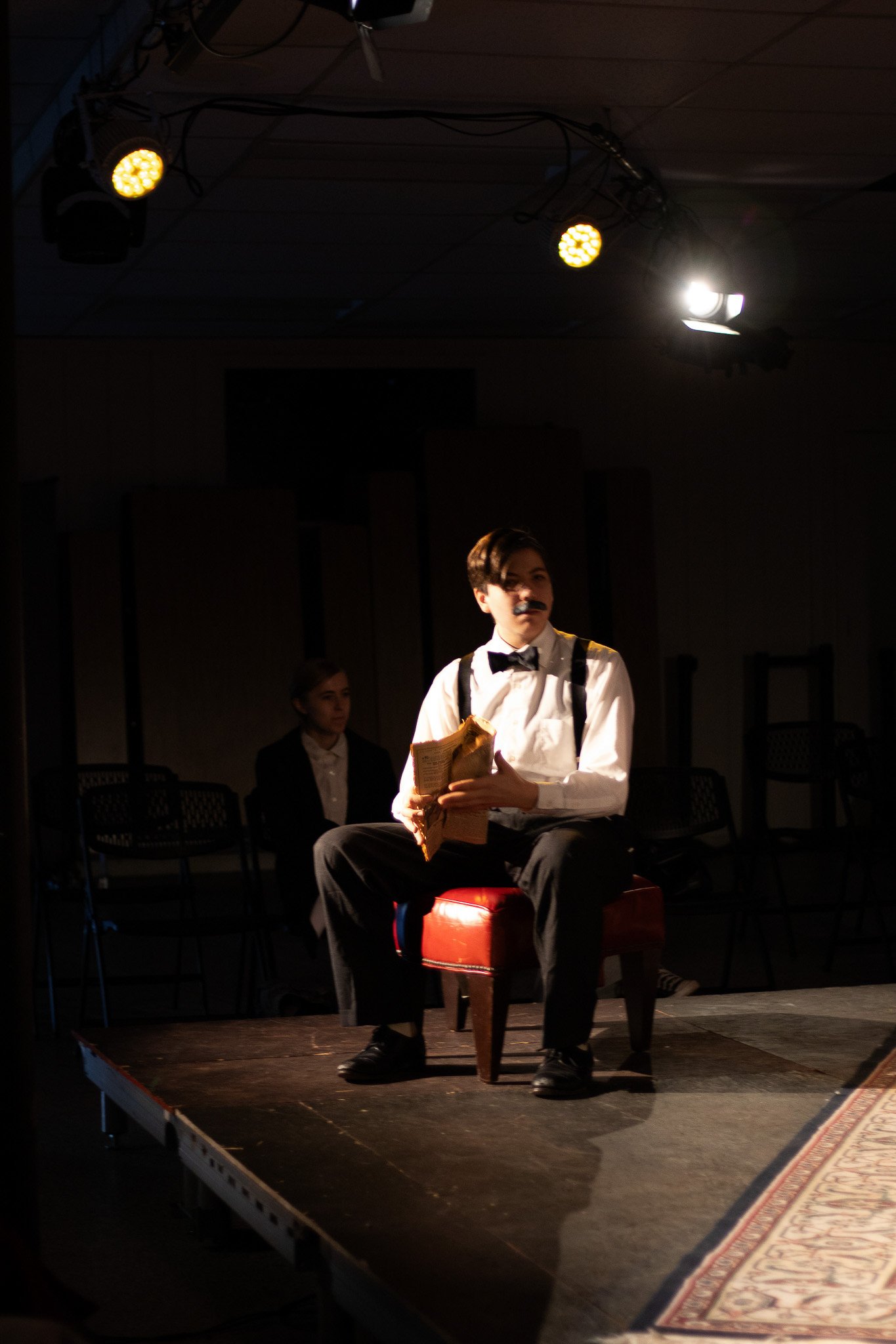
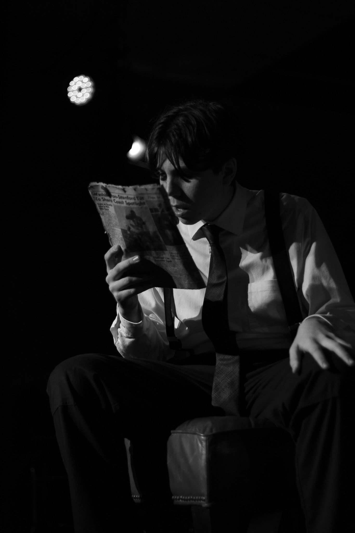
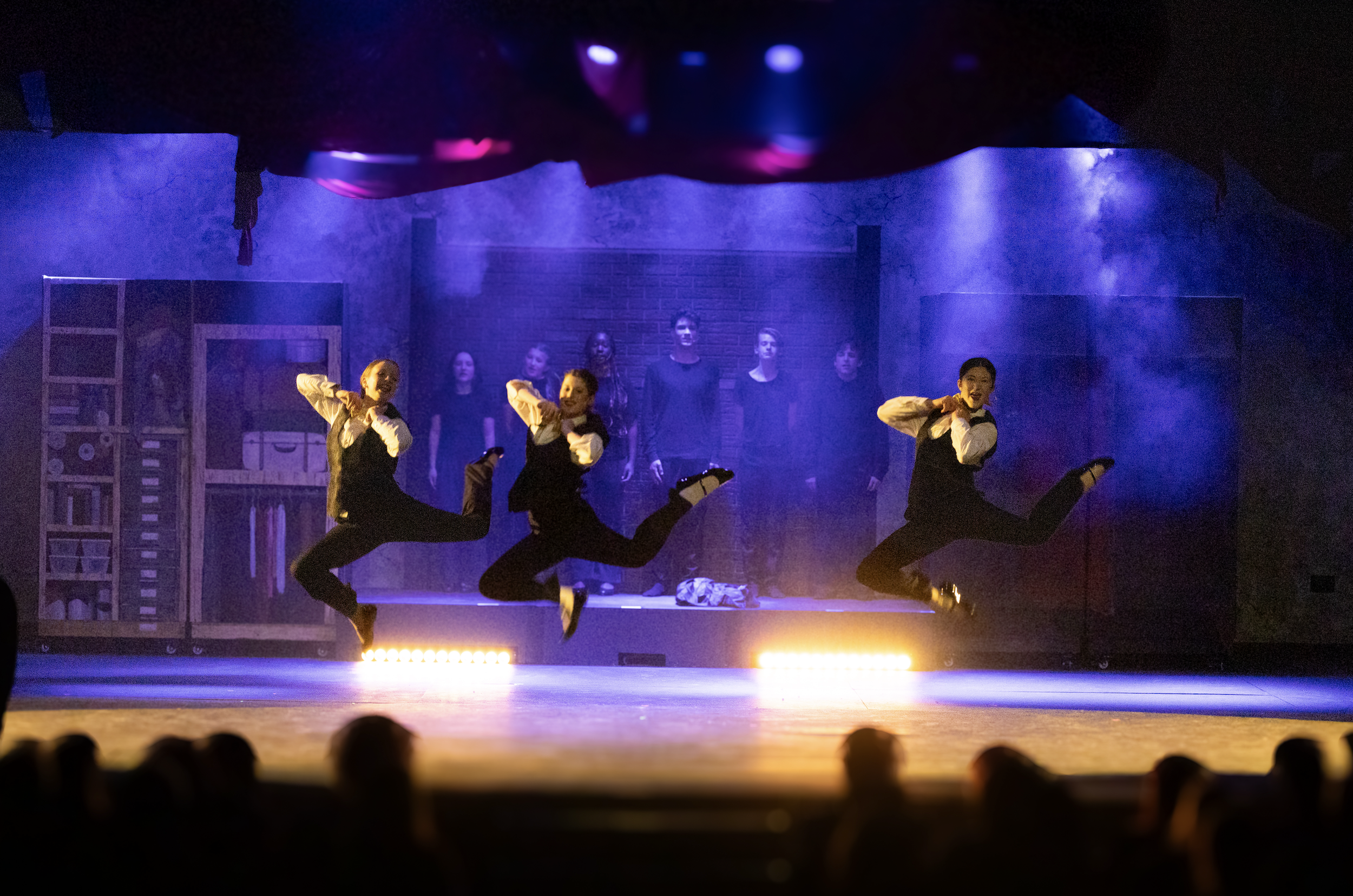
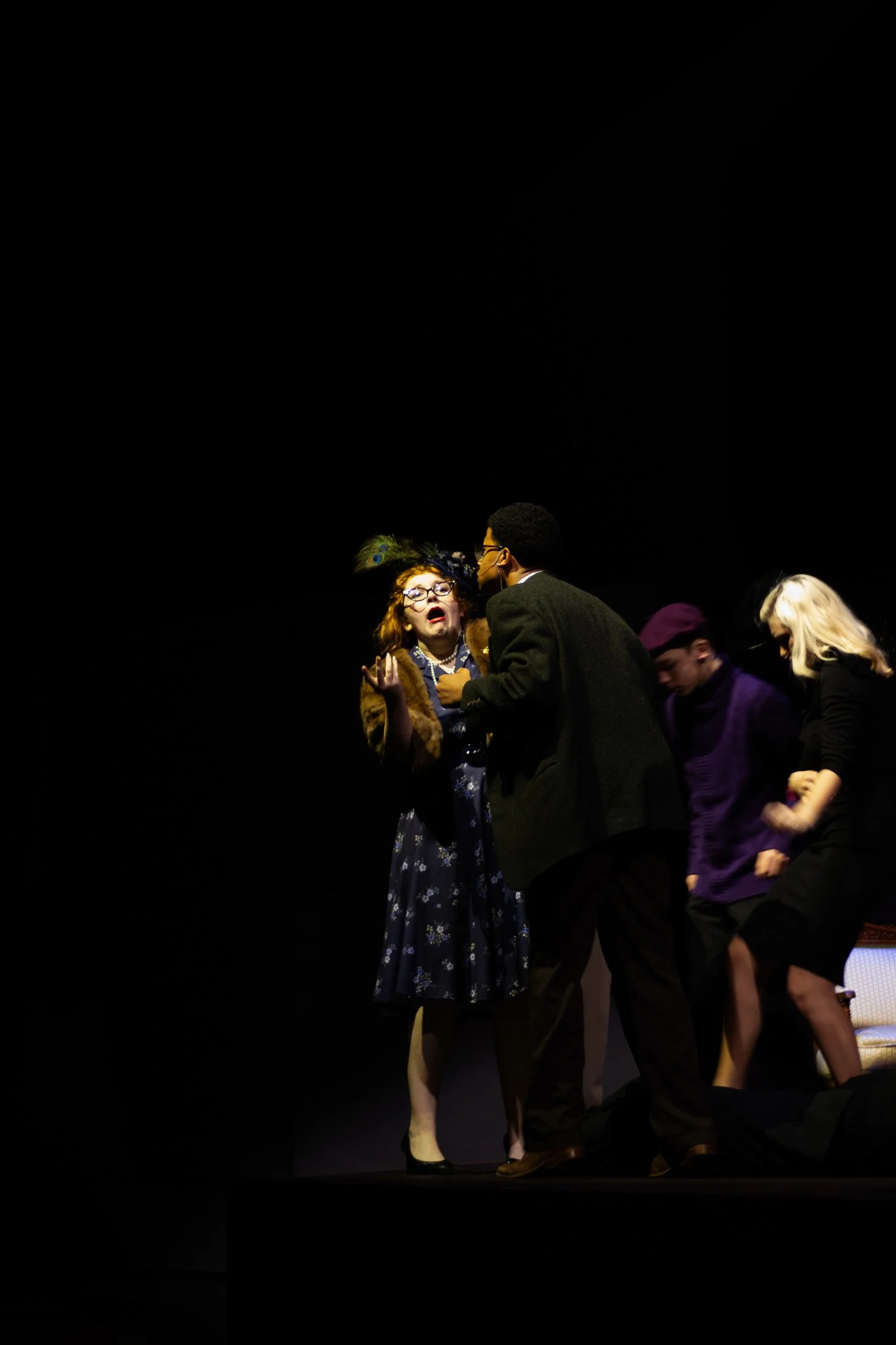
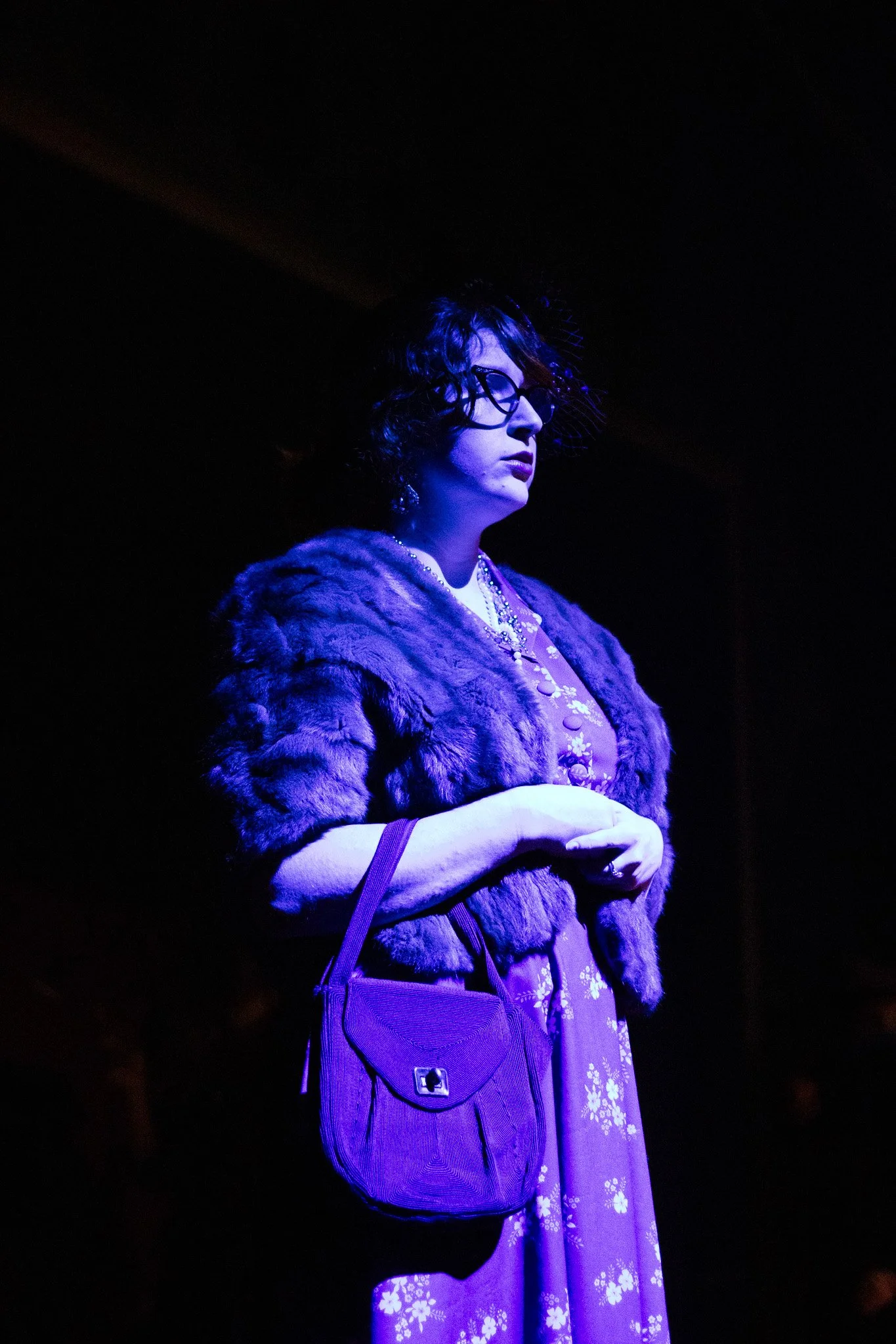
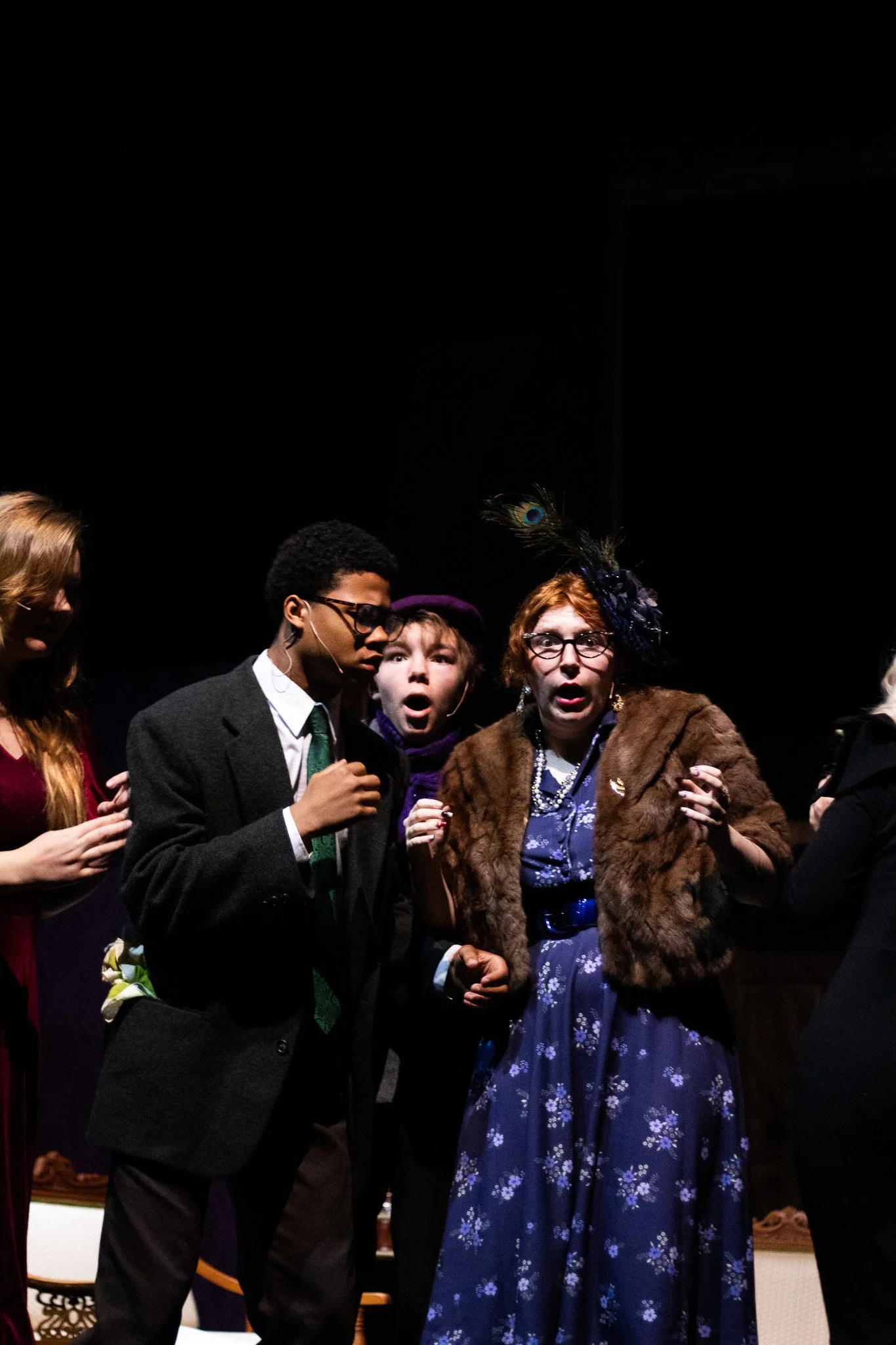
The 2026 Dramatic One Acts were among my favorite projects I’ve ever designed for. I had the opportunity to work with three distinct one-acts, each telling a powerful story about humanity from a different perspective.
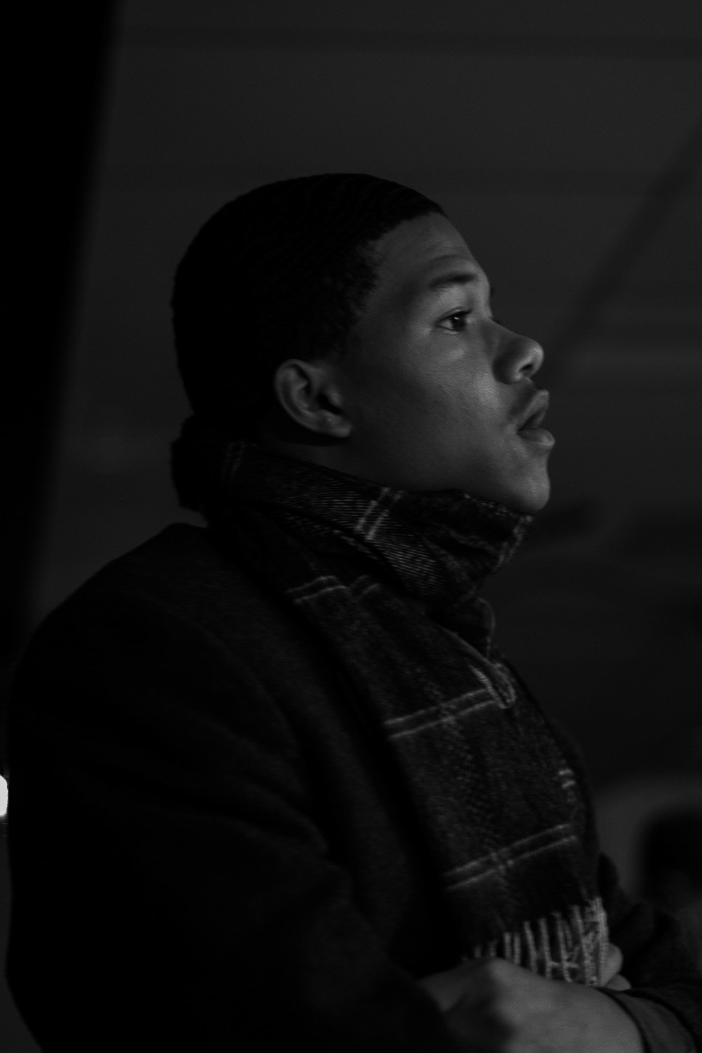
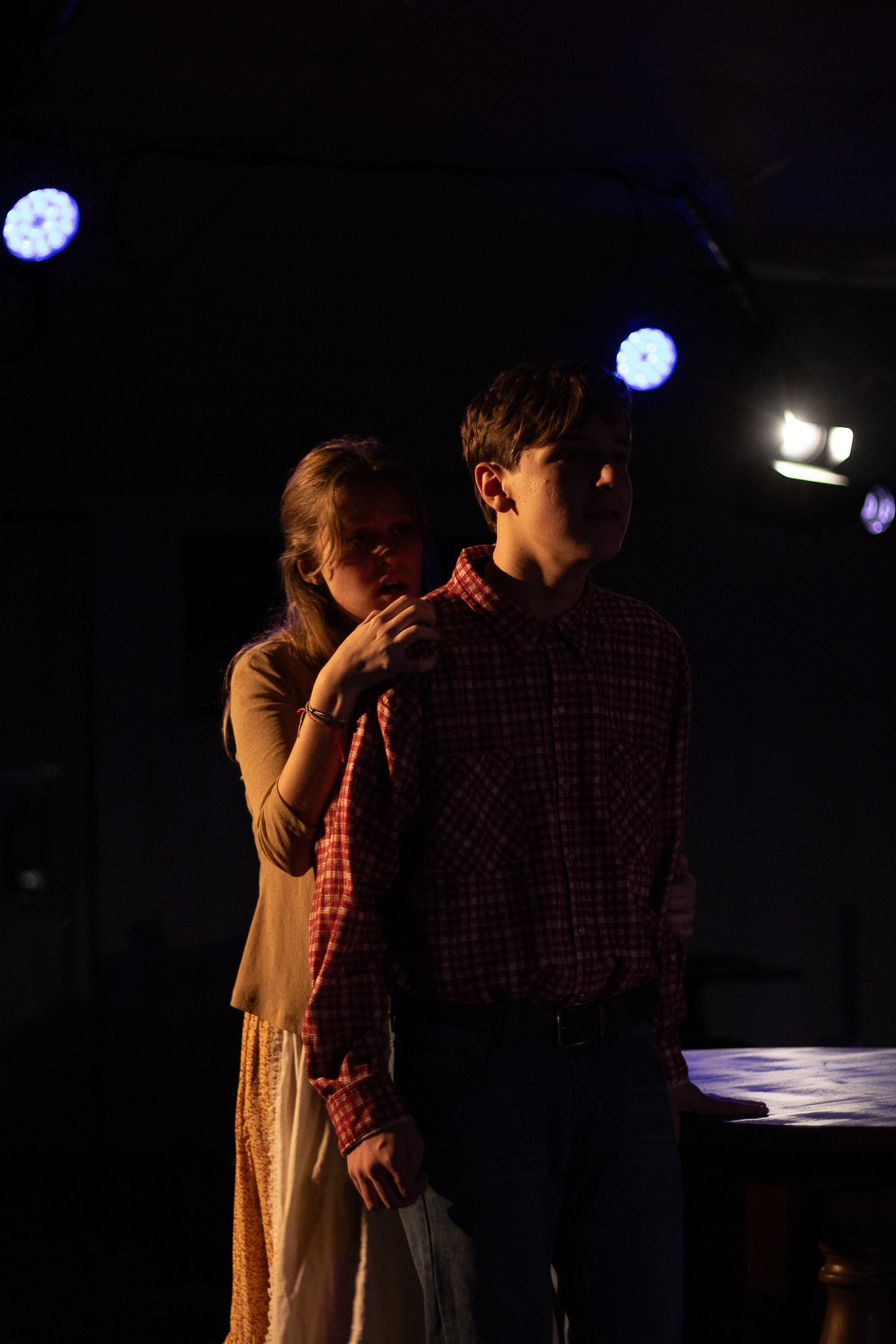
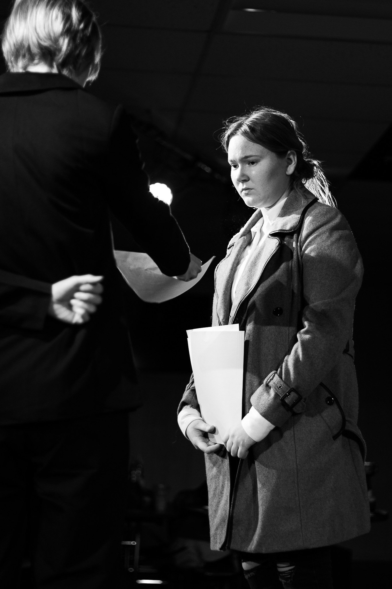
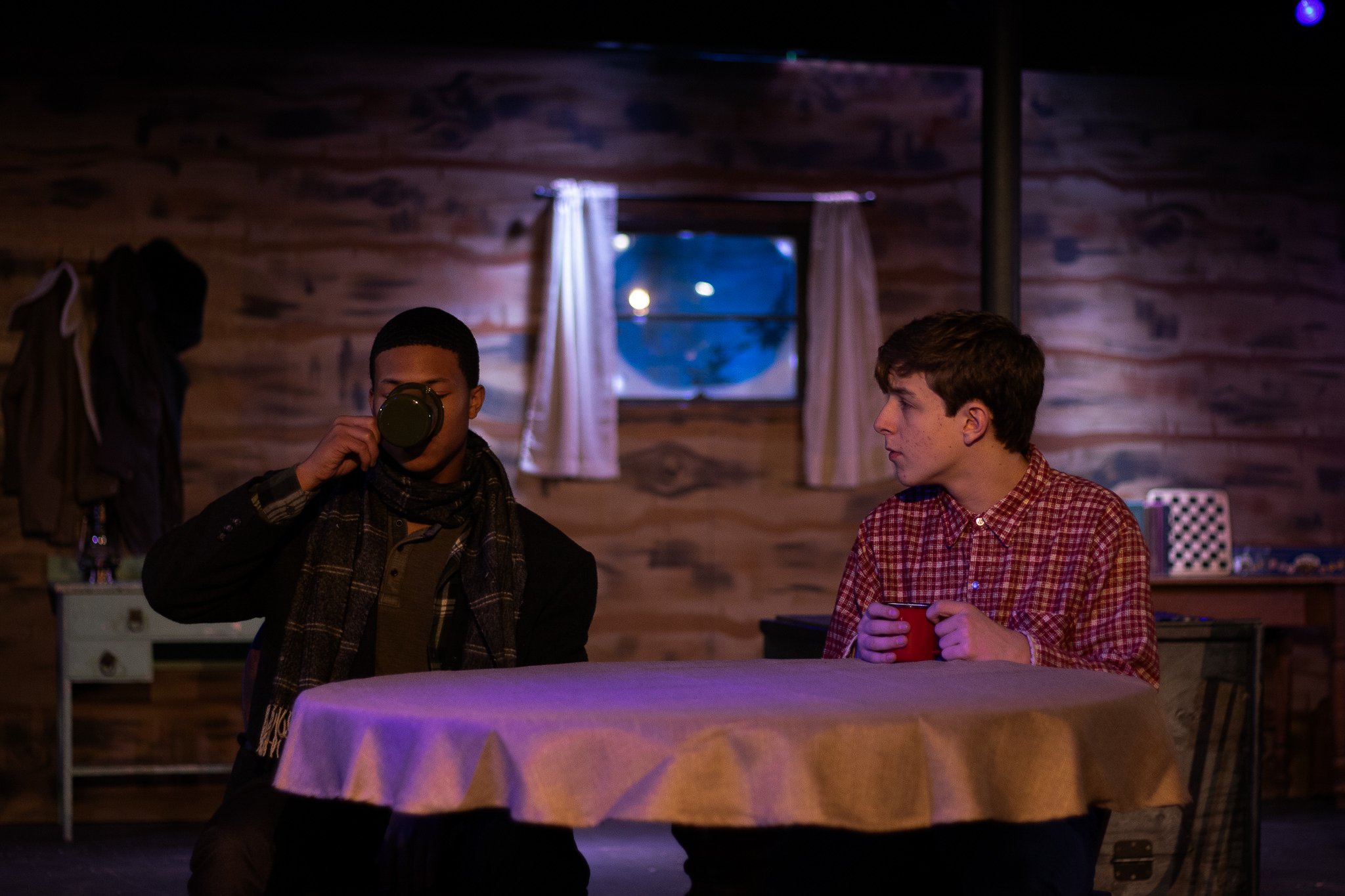
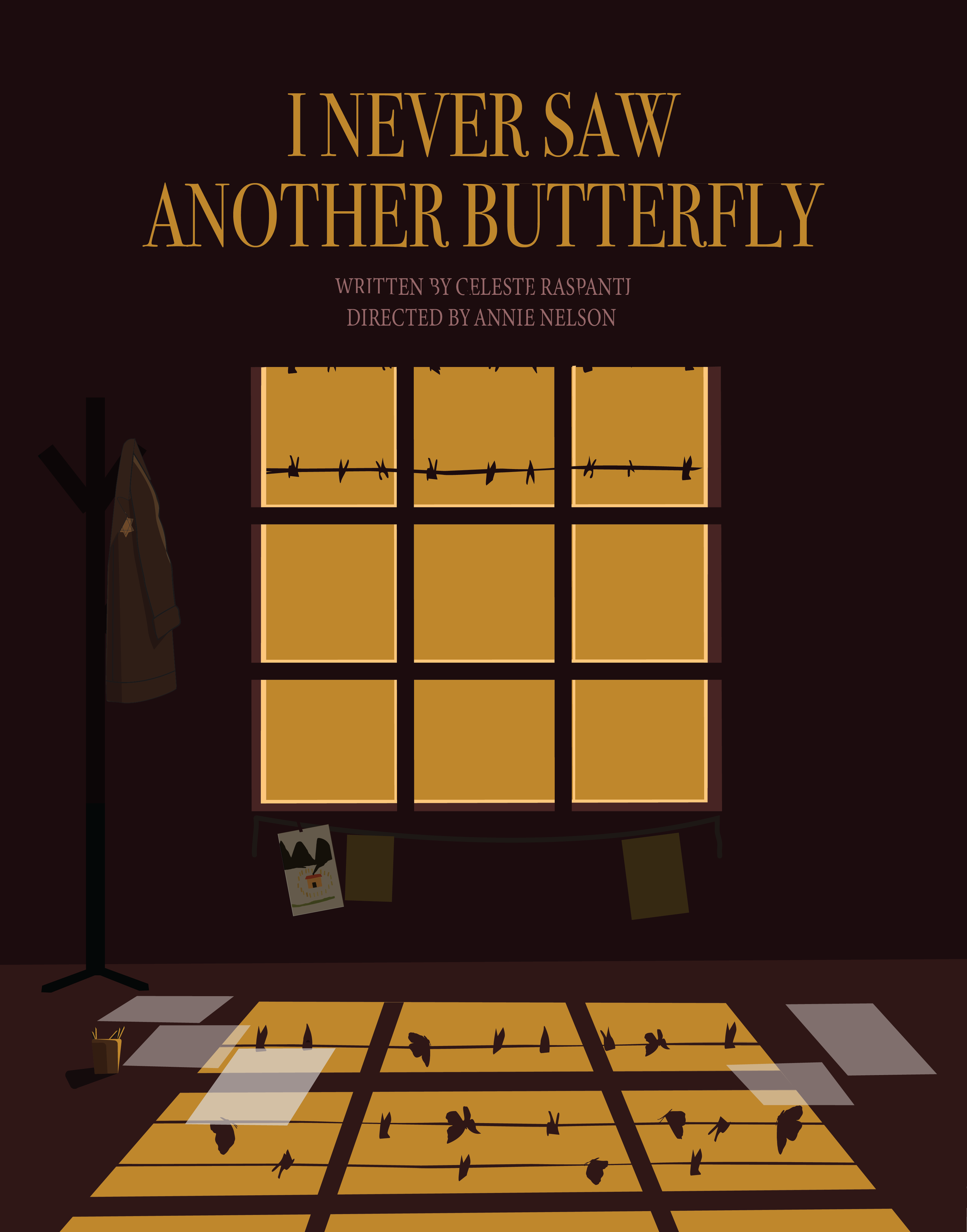
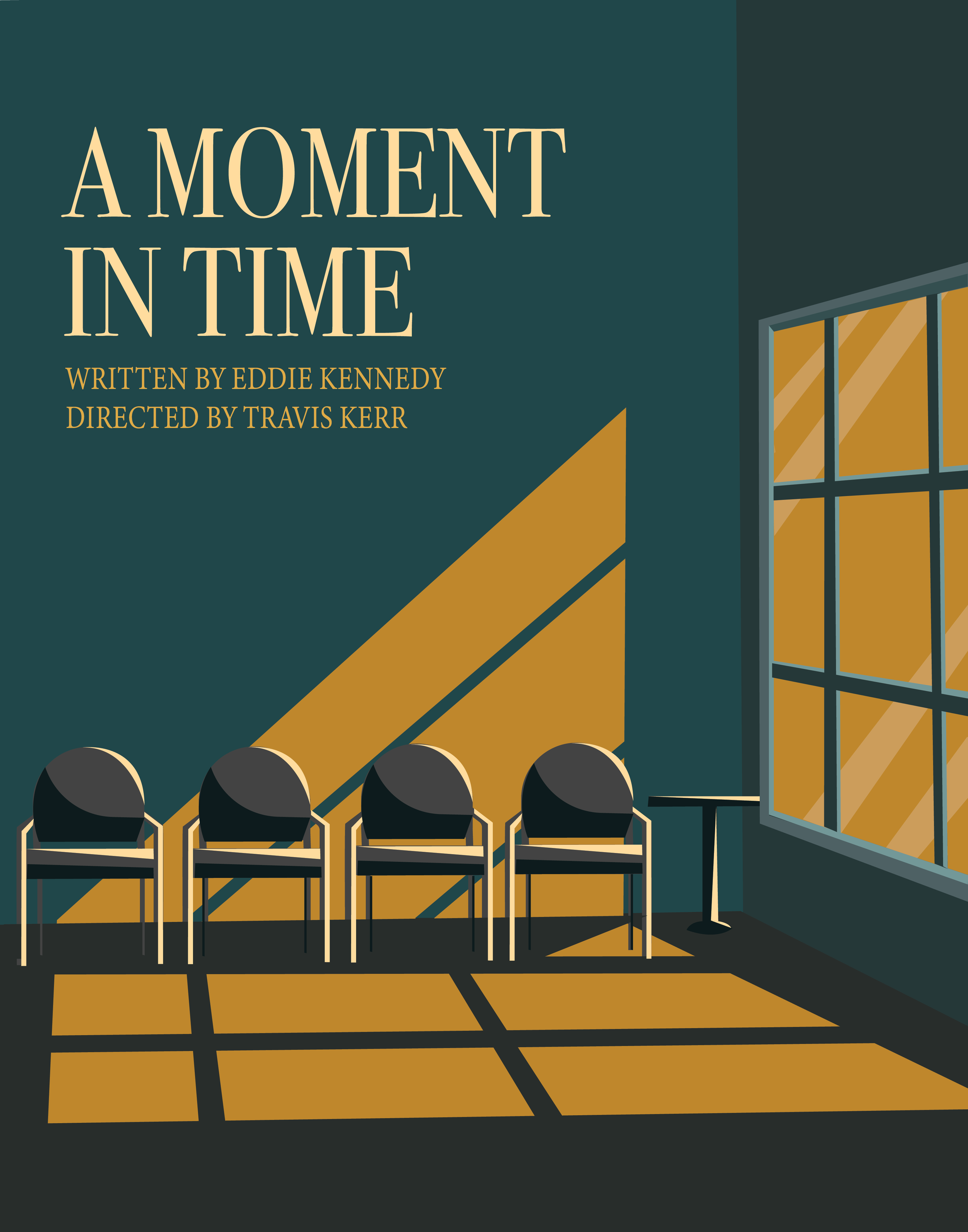
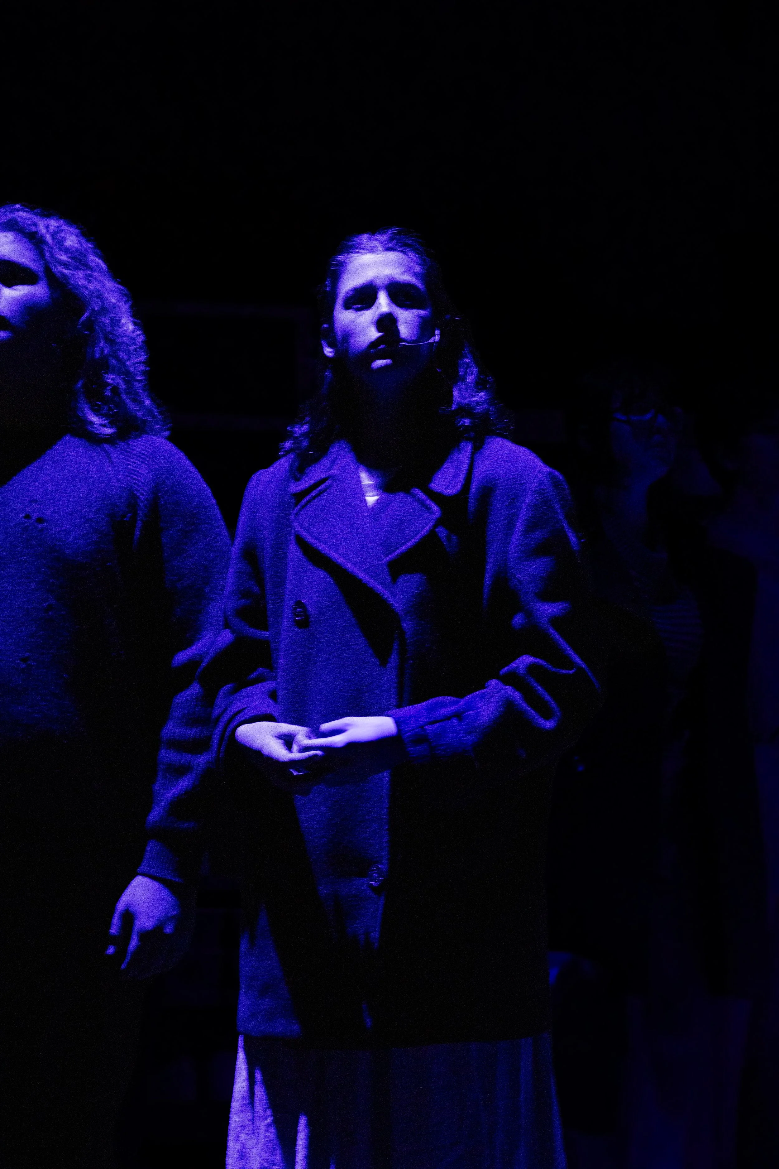
The Midnight Sun, adapted from a Twilight Zone episode, portrays the final days of Earth as the sun draws closer, capturing the fragility of life in the face of inevitable collapse. I Never Saw Another Butterfly, set among the children of Terezín, confronts a system designed to strip individuals of their humanity while preserving their voices through art and memory. A Moment in Time explores how human worth is affirmed through recognition, showing how a single, seemingly ordinary interaction can become transformative when one person truly sees another.
Early in the design process, I knew each one-act deserved its own poster—one that could extend the storytelling beyond the stage. The concept of using windows as a visual motif became the breakthrough, allowing each poster to act as a glimpse into its world while unifying the set as a whole. Within each design are subtle, hidden details—visual cues that resonate most deeply with those who experienced the stories on stage, rewarding viewers with a deeper layer of meaning.

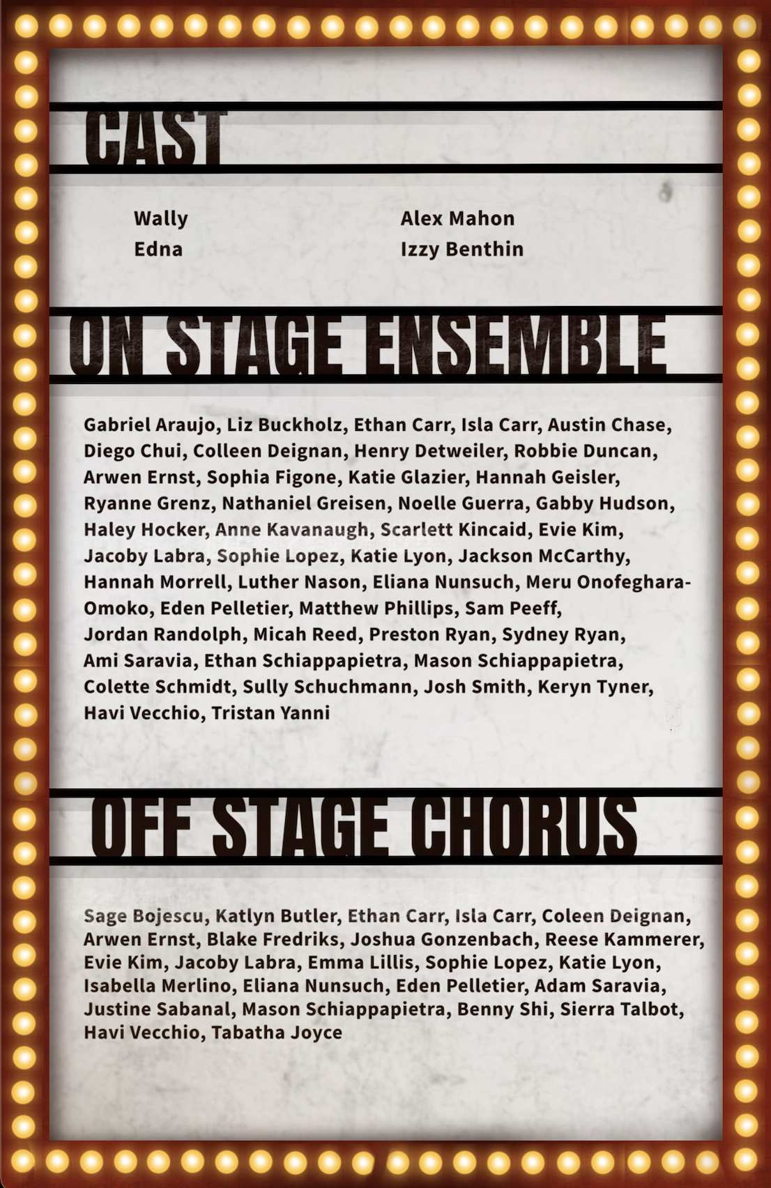


Farewell Foxwood
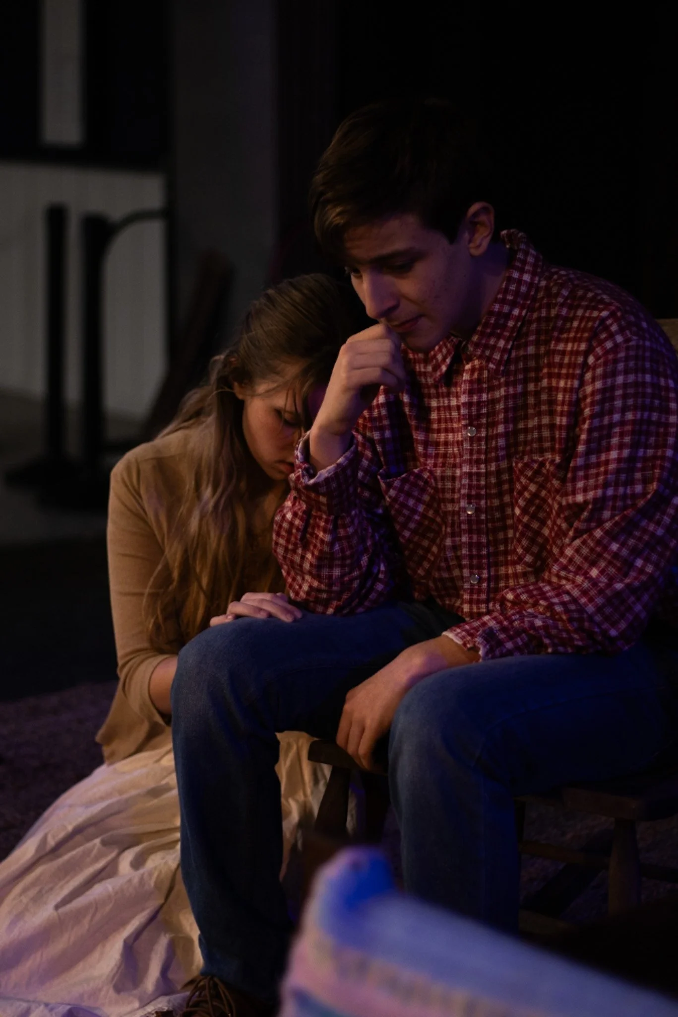
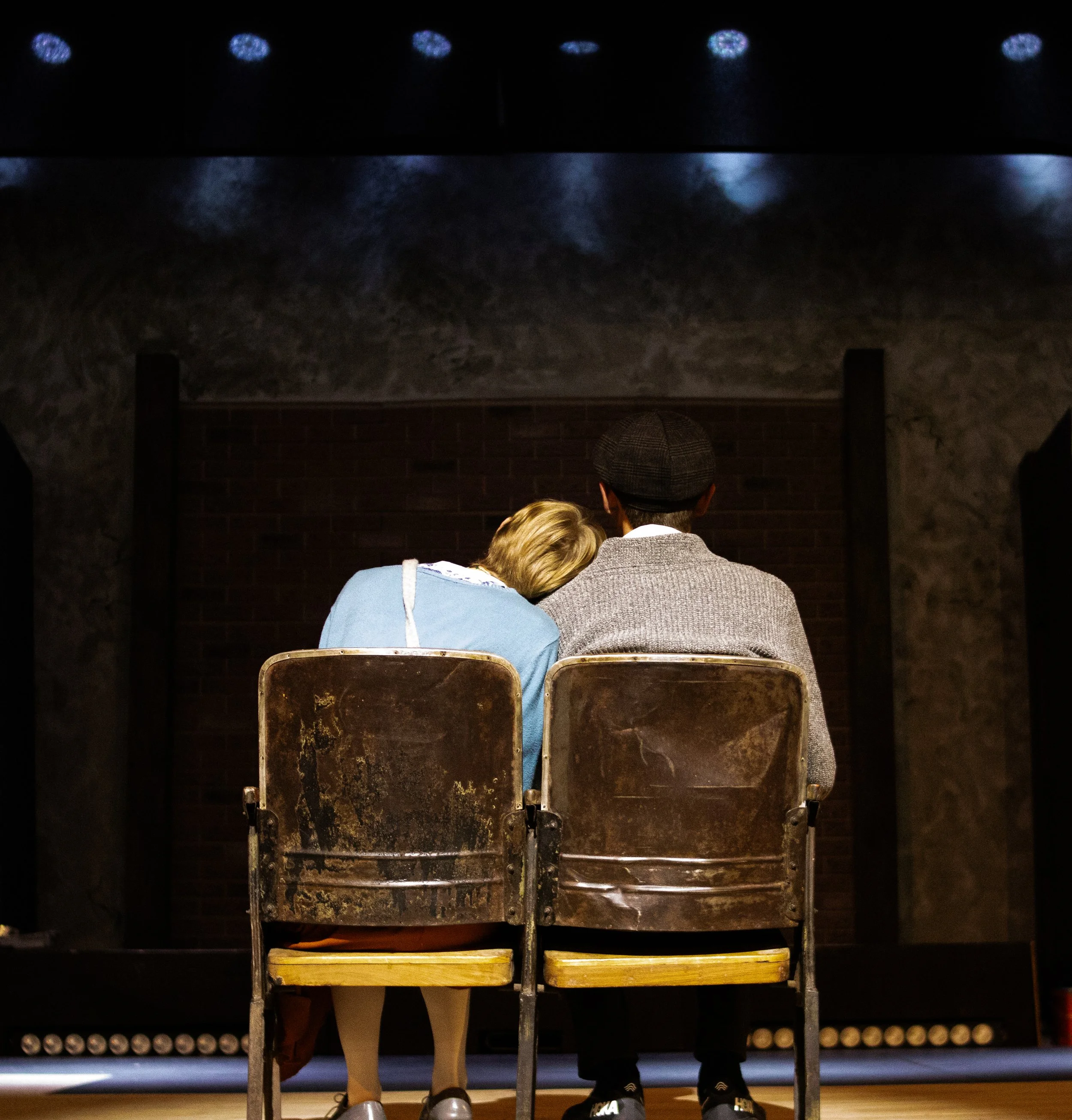
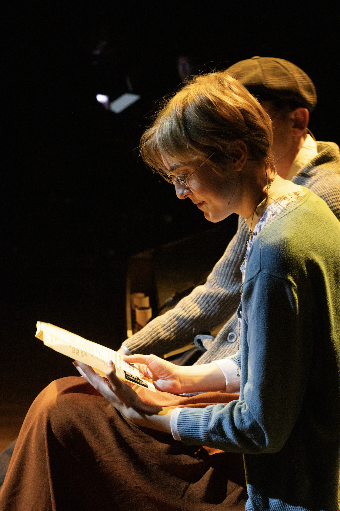
Designing for Farewell Foxwood was one of the most rewarding creative challenges I’ve taken on. This original musical revue gave me the opportunity to develop a visual identity from the ground up—one that honored both the show’s storyline and its emotional core.
Farewell Foxwood follows an aging couple who have owned and operated a beloved theater for decades. Now preparing to sell it, they revisit treasured memories from their time onstage and backstage. Through a blend of heartfelt ballads, playful ensemble numbers, and poignant moments, the revue captures the rich, layered history of The Foxwood.
For the design, I wanted to reflect the nostalgia and warmth of the story. I centered the visual around the couple, silhouetted in soft stage light, gazing toward their final curtain. In the shadows of that curtain are figures from the songs performed throughout the show—representing how these characters not only inhabit the theater’s history but exist because of this couple’s legacy.
To bring this concept to life, I chose a digitally painted style that feels personal, hand-crafted, and timeless. I wanted the design to evoke a sense of familiarity and nostalgia—something that felt like a memory in and of itself.
The Playbill Spreads

For this spread, I didn’t want the storytelling to live solely on the main poster—I wanted it to flow throughout the entire playbill. The inside spread references a note left by the older couple to the theater’s next owners, featured at the end of the show. Surrounding the note are personal items they leave behind, each tied to a cherished memory from their time running the theater. The inside design is intentionally dusty, worn, and aged, evoking the history of the space. In contrast, the cast inserts are clean and vibrant—reflecting the energy of a brand-new show. The back cover represents the back of the theater, or stage door, further emphasizing the building’s age and slow decay.
Altogether, the spread is meant to reflect the passing of time—the beauty of what once was, the excitement of what’s to come, and the emotional weight of letting go.
TELLING THE STORY ON PAPER
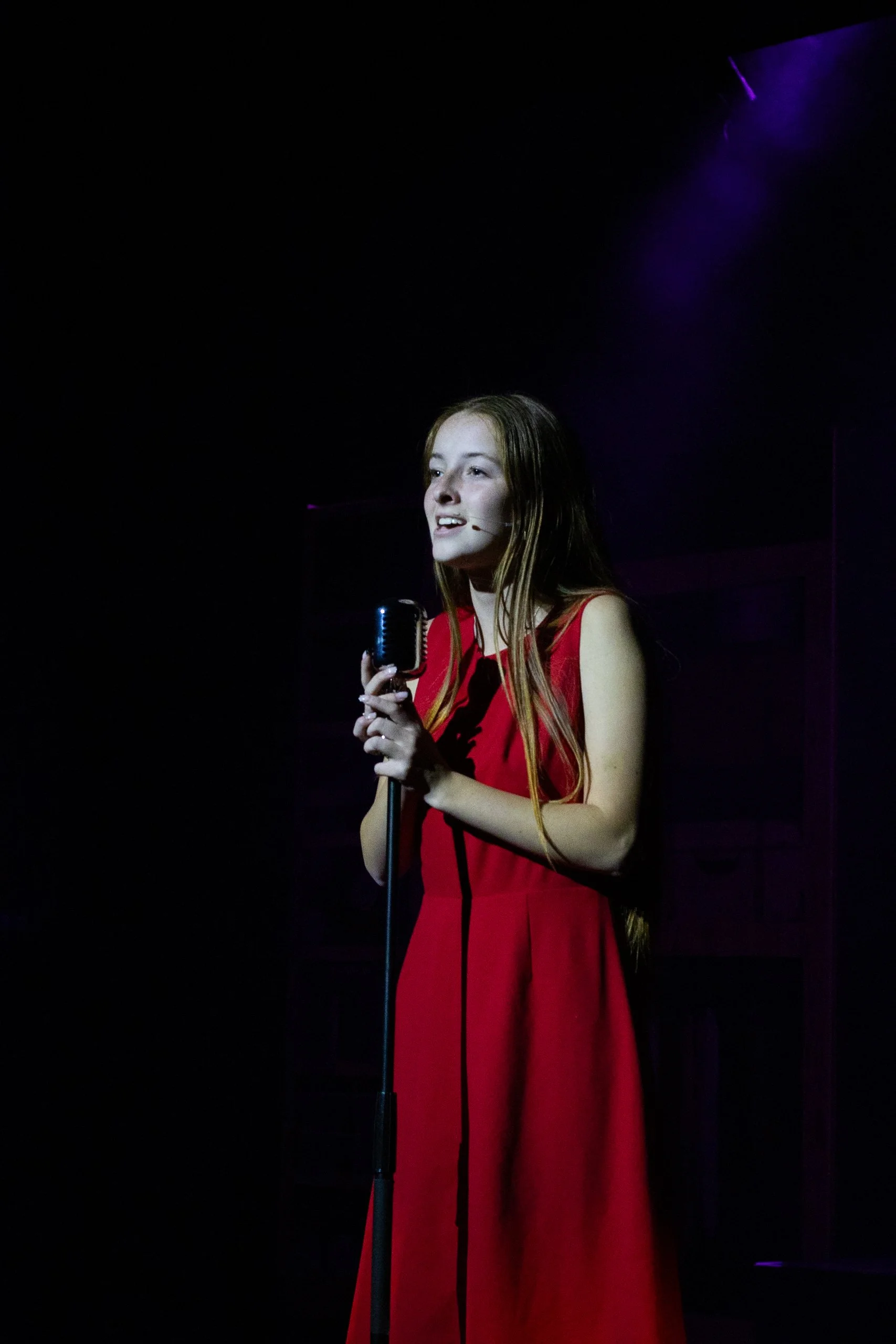
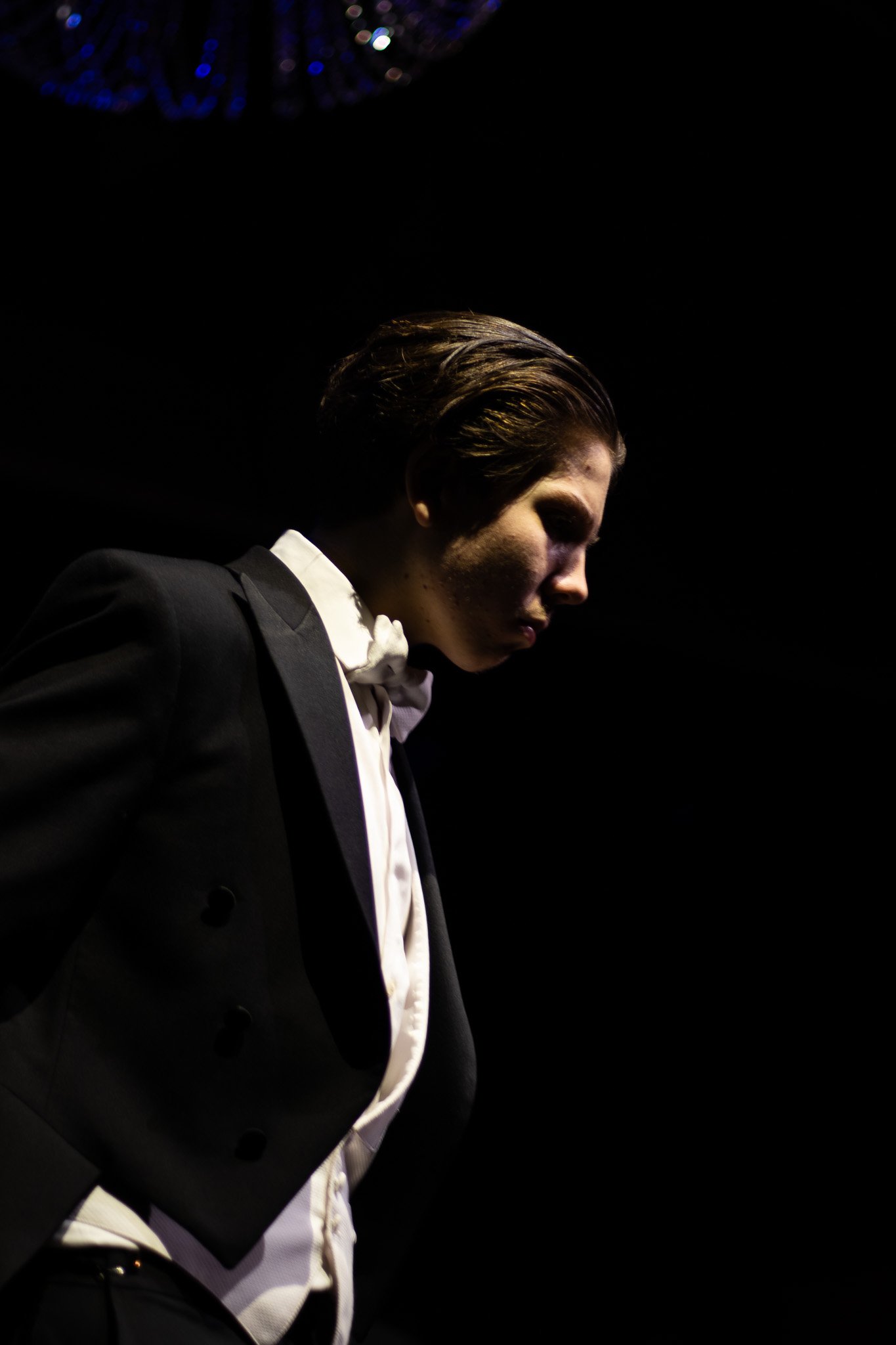
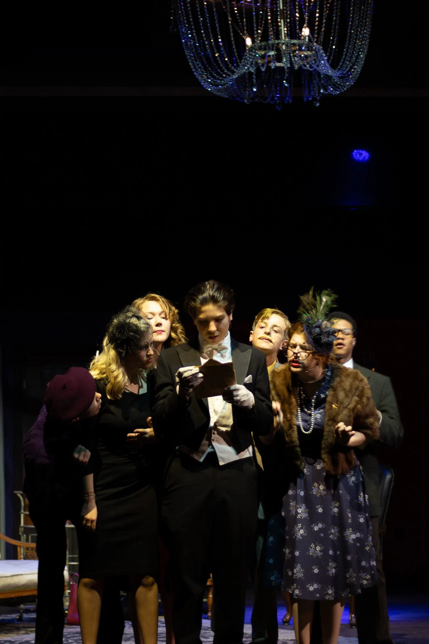
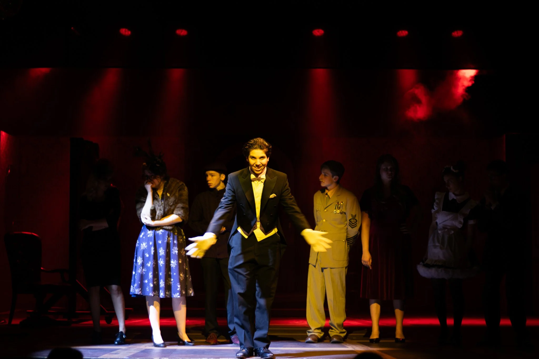
The Foxwood Photographed


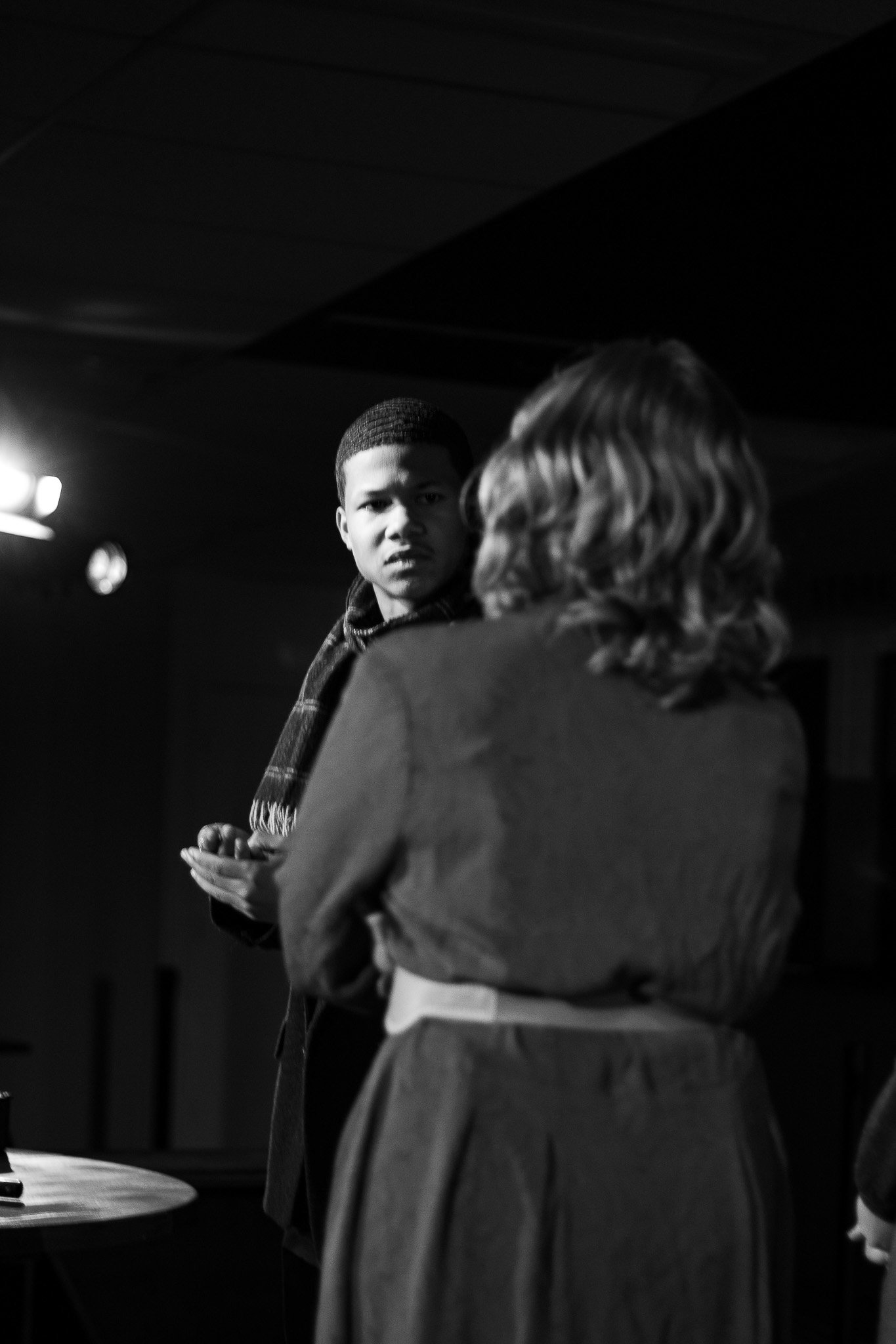
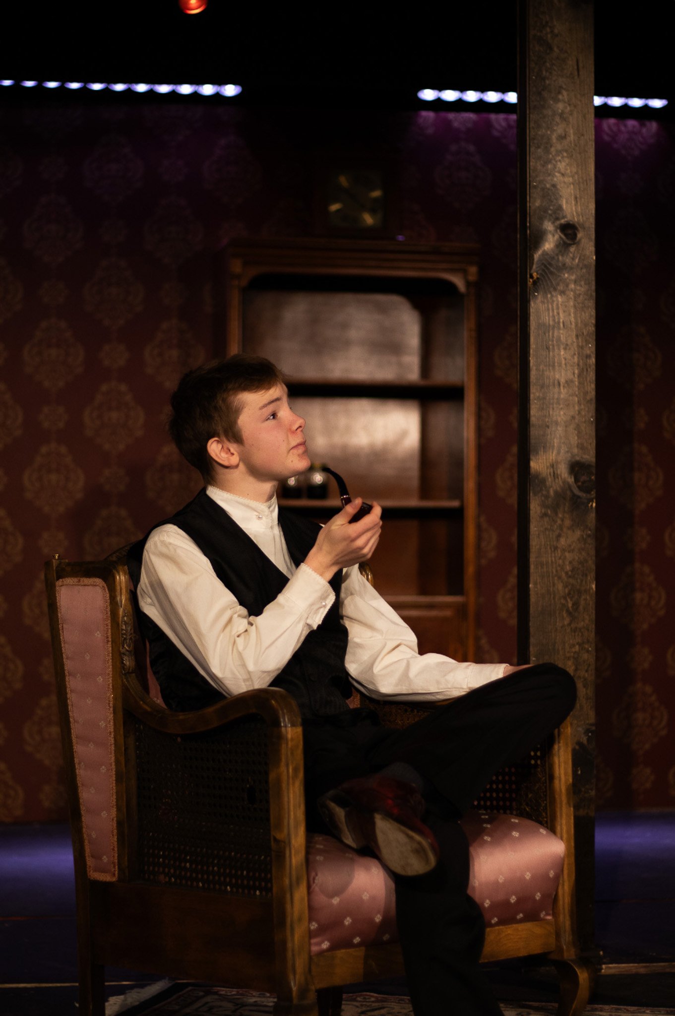
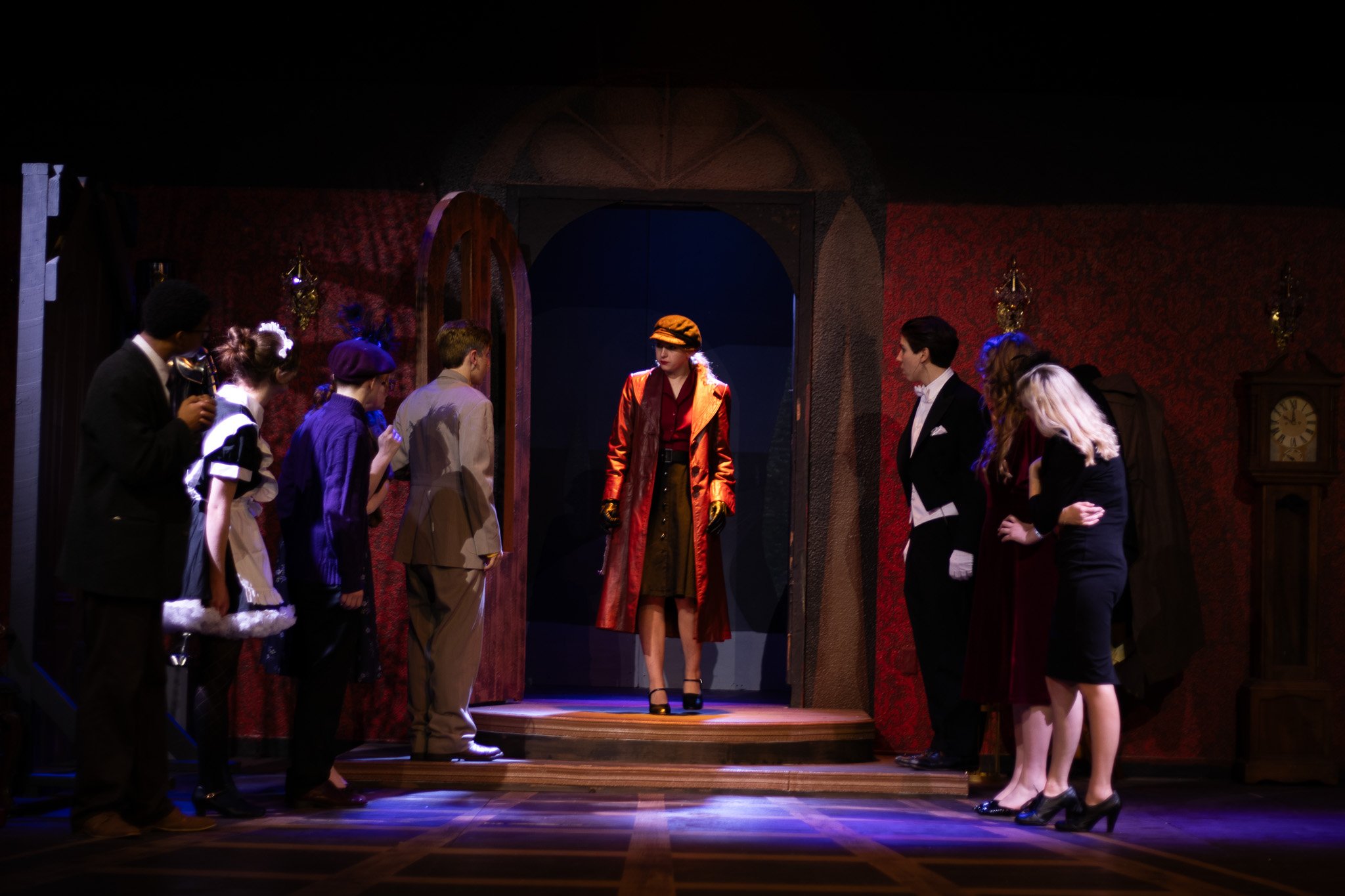
CLUE on stage
MAIN POSTER DESIGN

While designing the main poster for Clue, I drew inspiration from the original posters and had the exciting opportunity to create a version unique to our production. What sets this poster apart is its personalized touch—it’s tailored specifically to our cast and our interpretation of the story, making it truly one-of-a-kind.
This is one of my all-time favorite theater designs. I had the privilege of photographing the cast in costume, which sparked the idea for this poster. I love how it captures the individuality of this specific cast, making it a truly one-of-a-kind creation.
CAST POSTER DESIGN
This secondary poster was designed to complement the primary marketing materials for the performance. I thoroughly enjoyed creating this piece, as it allowed me to delve into the original Clue board game for inspiration and craft a design uniquely tailored to our show.
SECOND POSTER DESIGN
PLAYBILL AND CAST


PLAYBILL CREATION
As opening night approaches, designing the playbill becomes one of my favorite parts of the creative process. For Clue, I aimed to make the playbill both engaging and interactive. The design reflects the thrilling search for the murder mystery’s victims and suspects. During intermission, the audience could scan a QR code and cast their vote on who they believed the murderer was, adding an immersive layer to the experience.
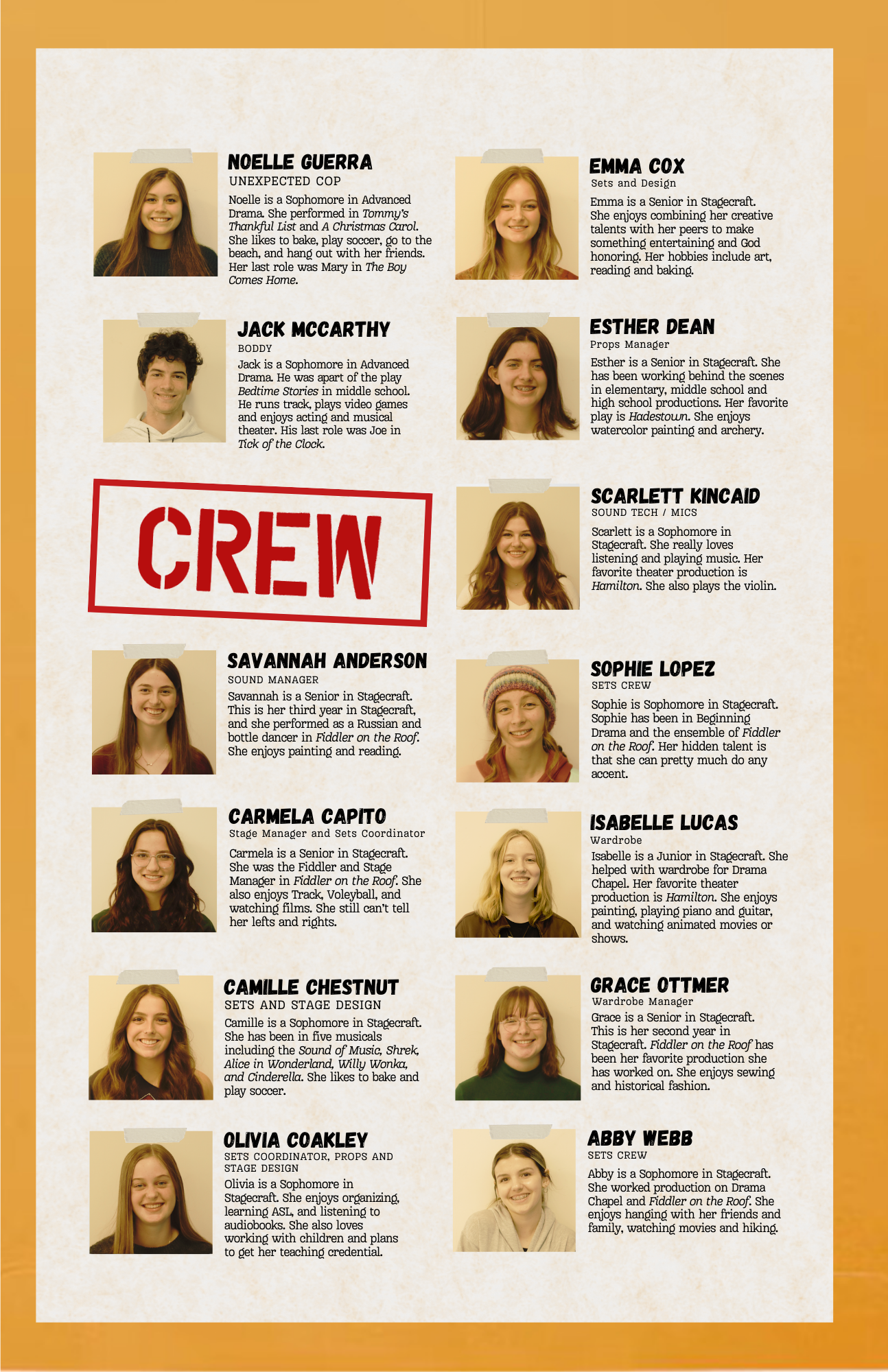
CAST HEADSHOTS


THIS MURDER WAS STAGED
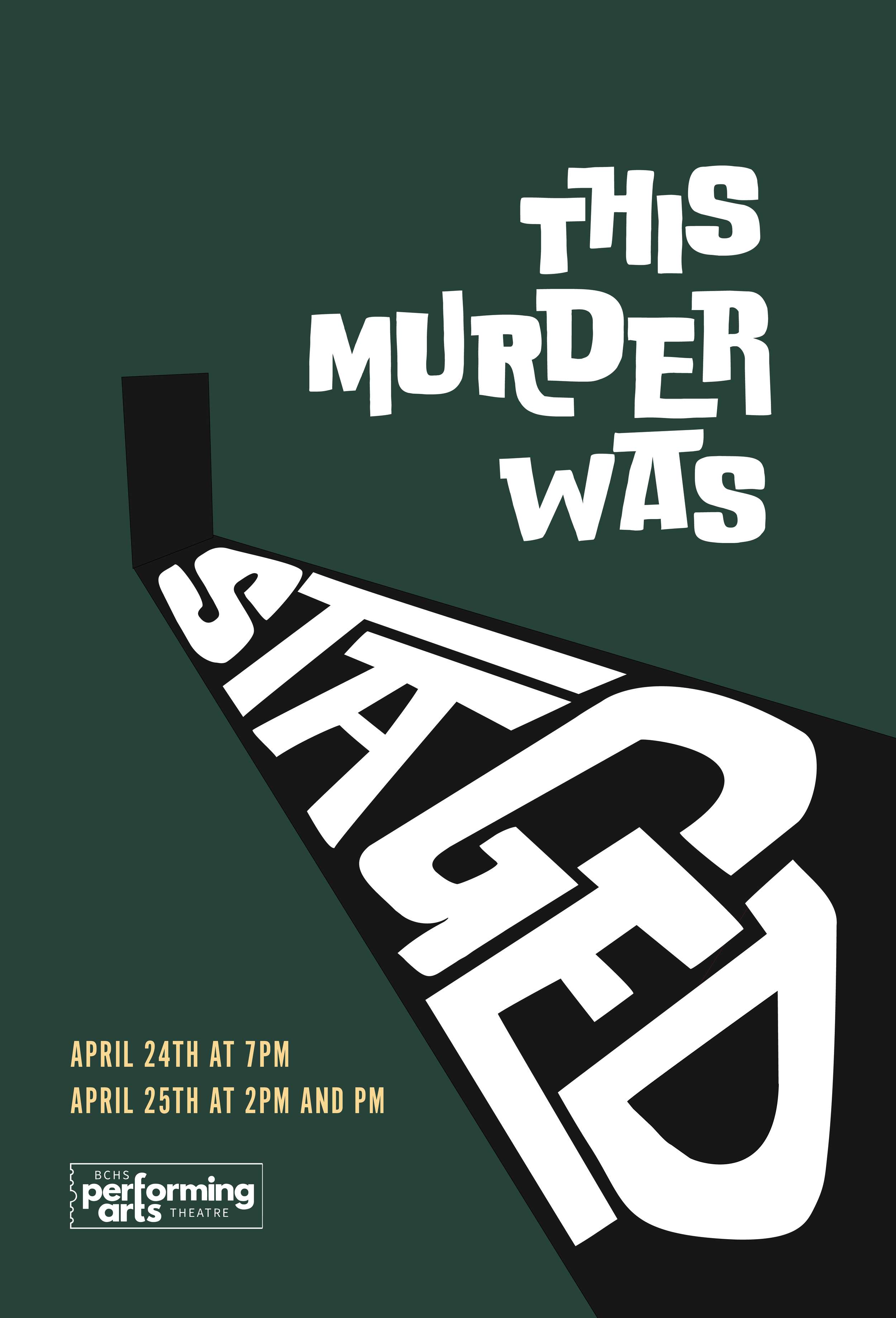
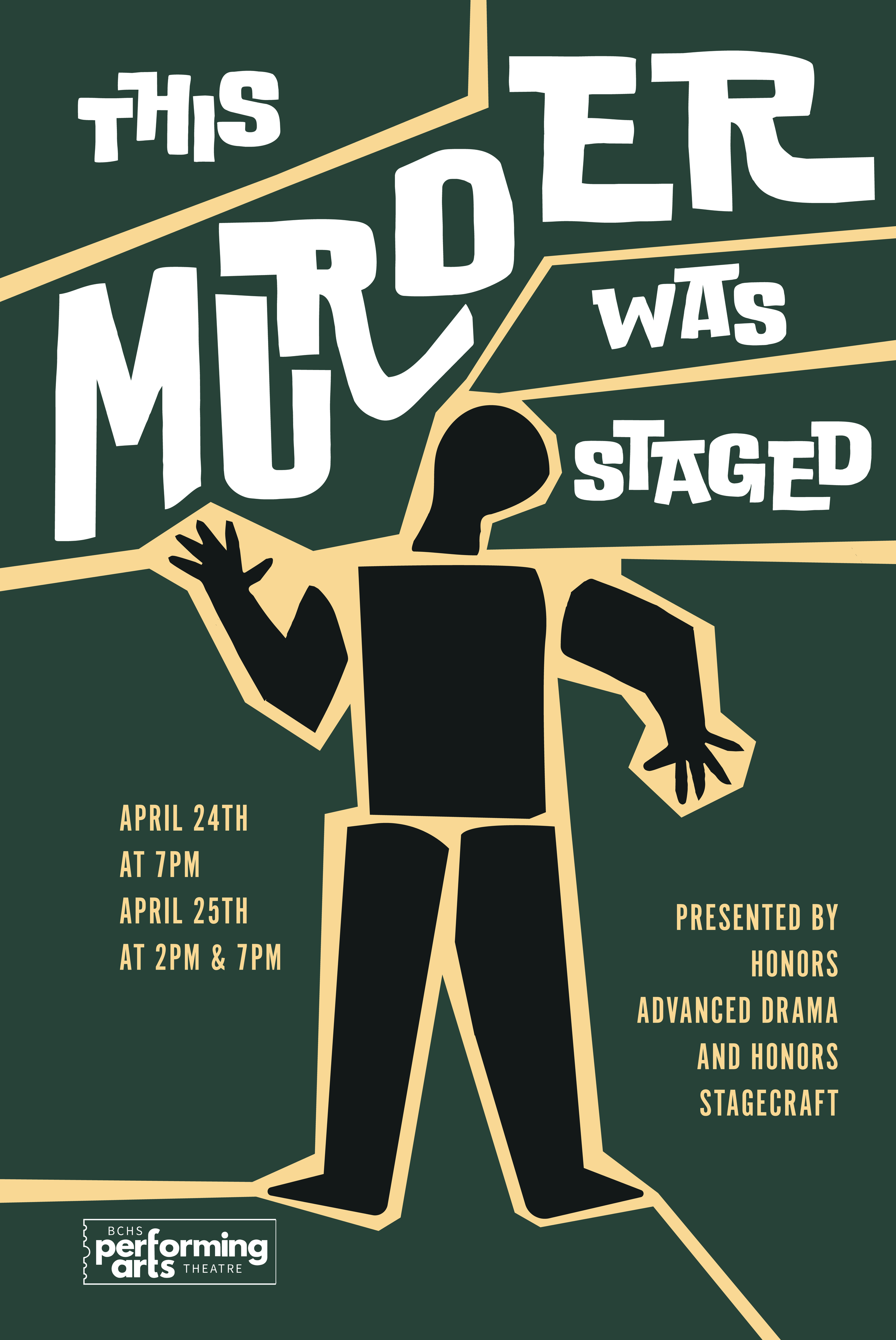
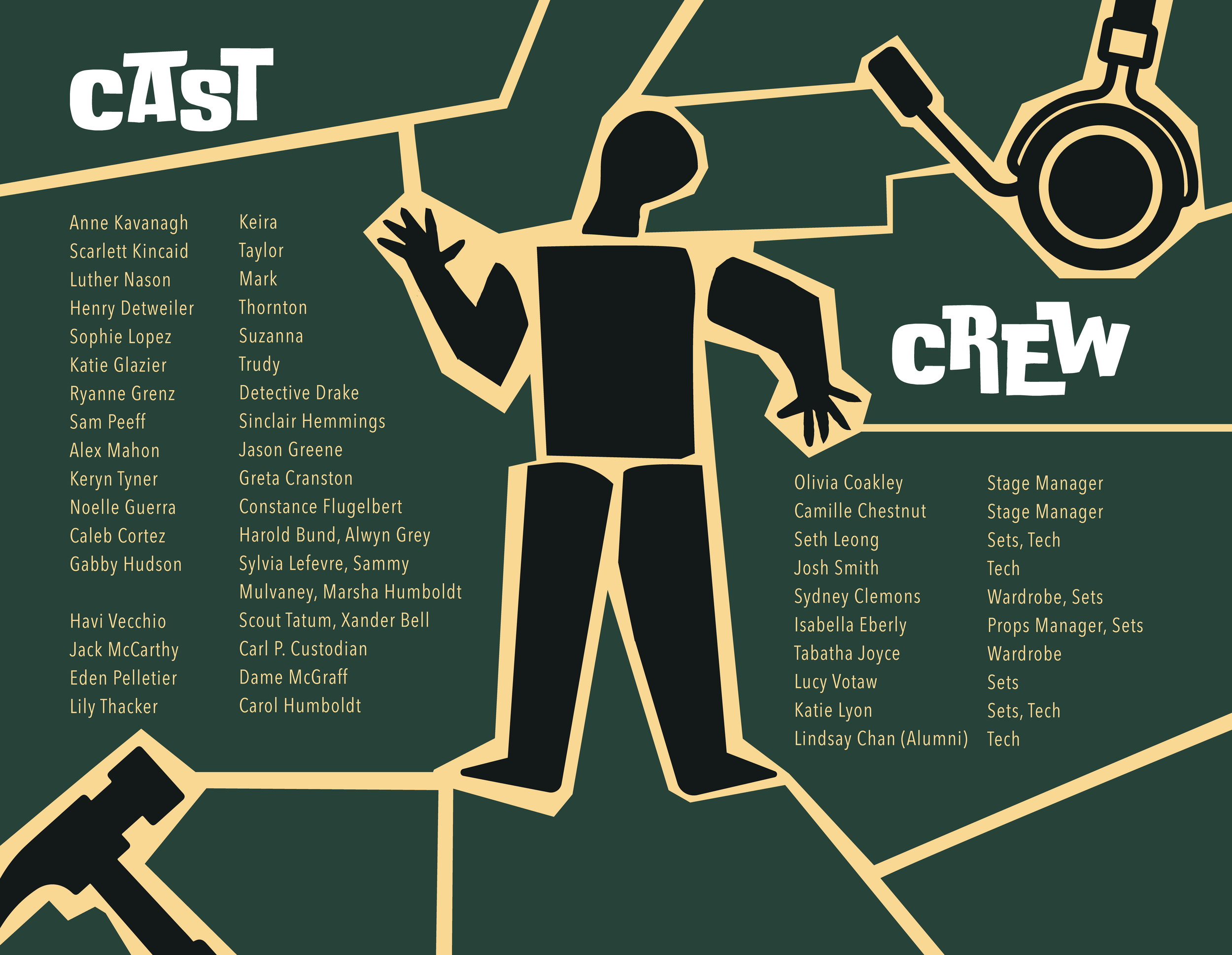
POSTER AND PLAYBILL
As this production began, I wanted to focus on replicating the Saul Bass style of mystery and murder. I used typography as the central visual element, drawing inspiration from Bass’s bold, graphic approach to storytelling. By allowing the type to become the primary figure in the composition, I was able to create a sense of tension and intrigue that reflects the suspenseful nature of the production.
I also incorporated a green pulled directly from the stage set, helping to visually connect the marketing materials with the onstage experience. The limited color palette, strong contrast, and dynamic arrangement of text work together to evoke the themes of mystery, danger, and uncertainty present throughout the show.
CLUE PHOTOGRAPHED


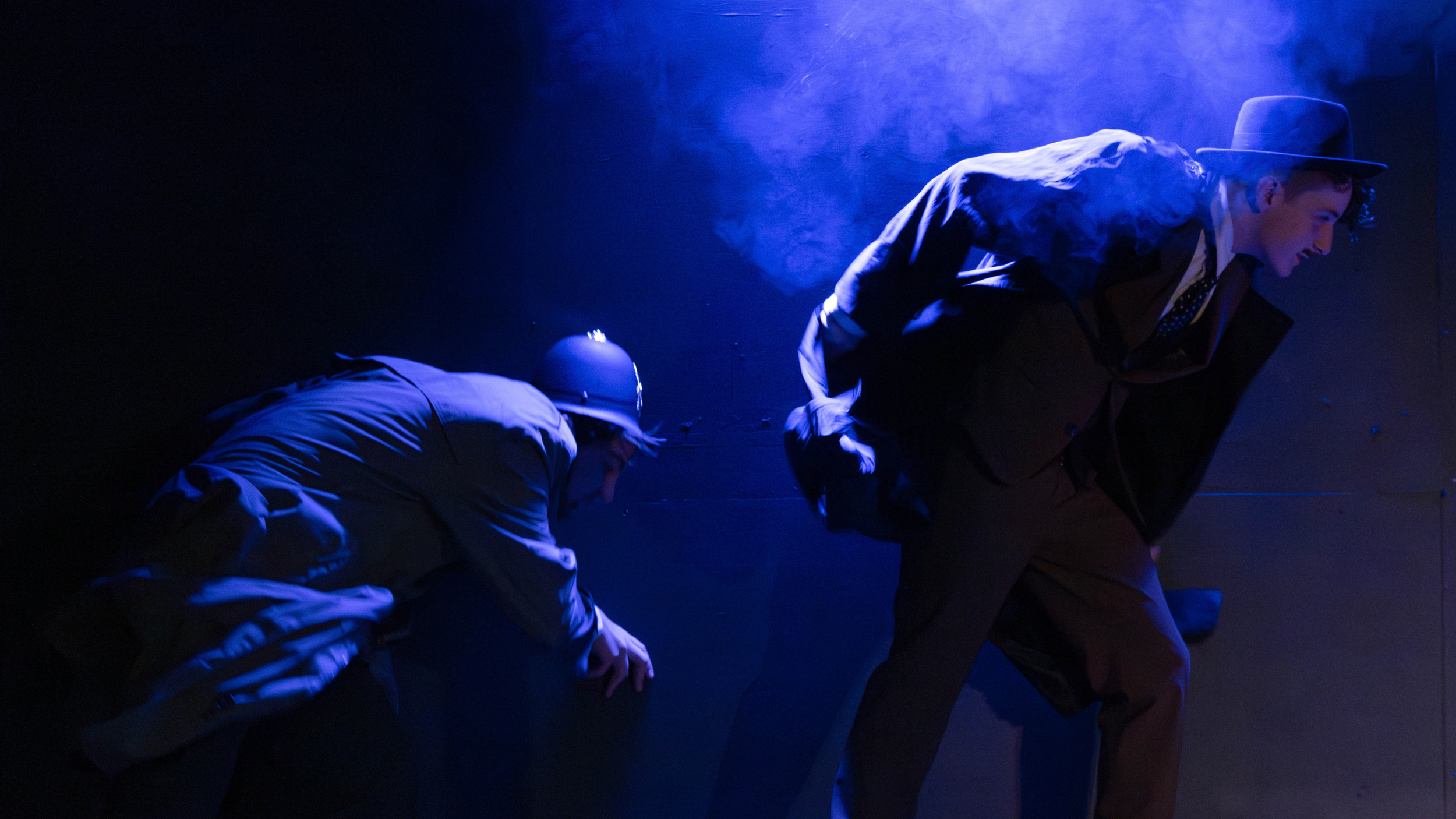
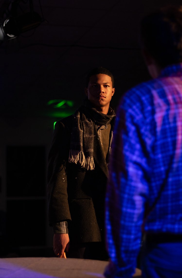
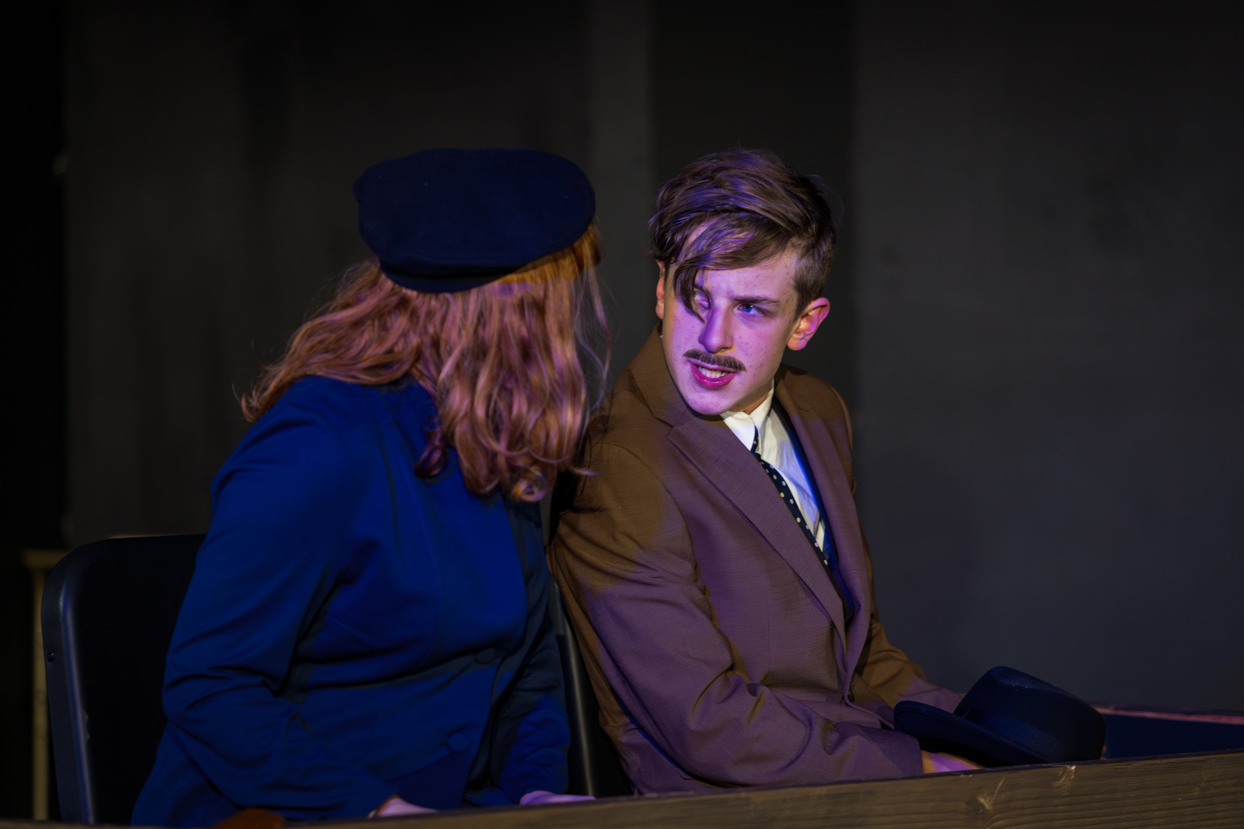
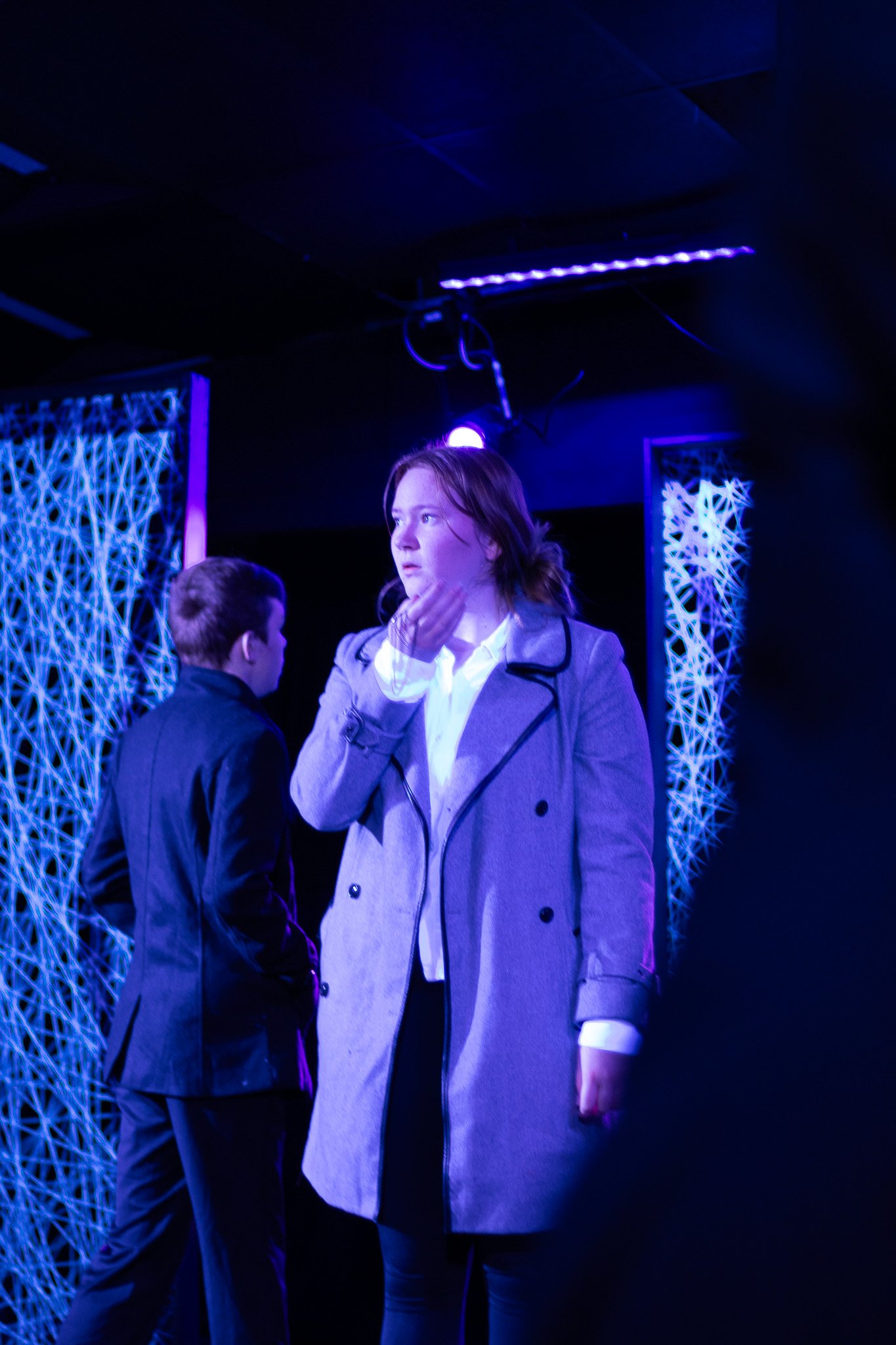
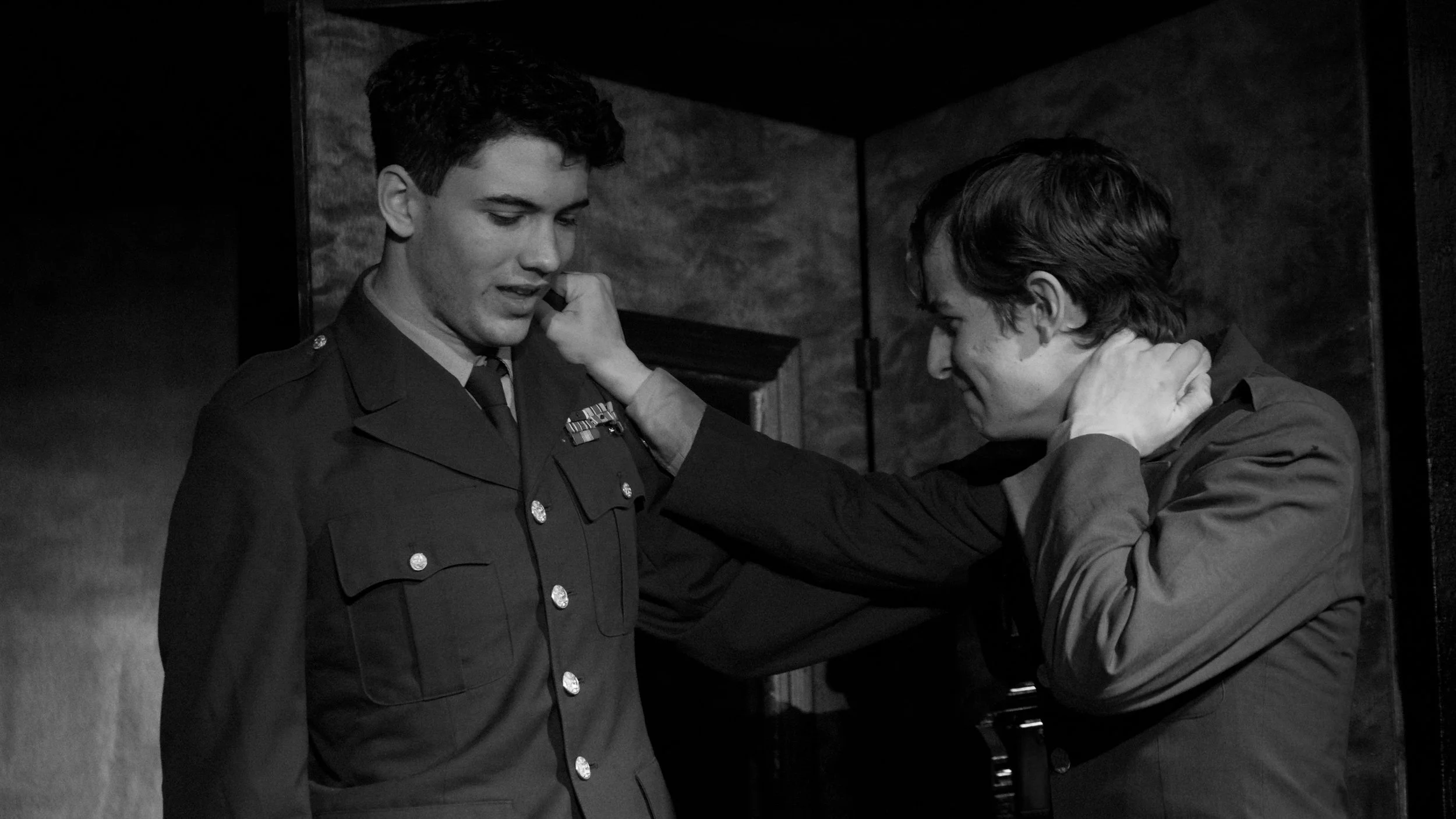
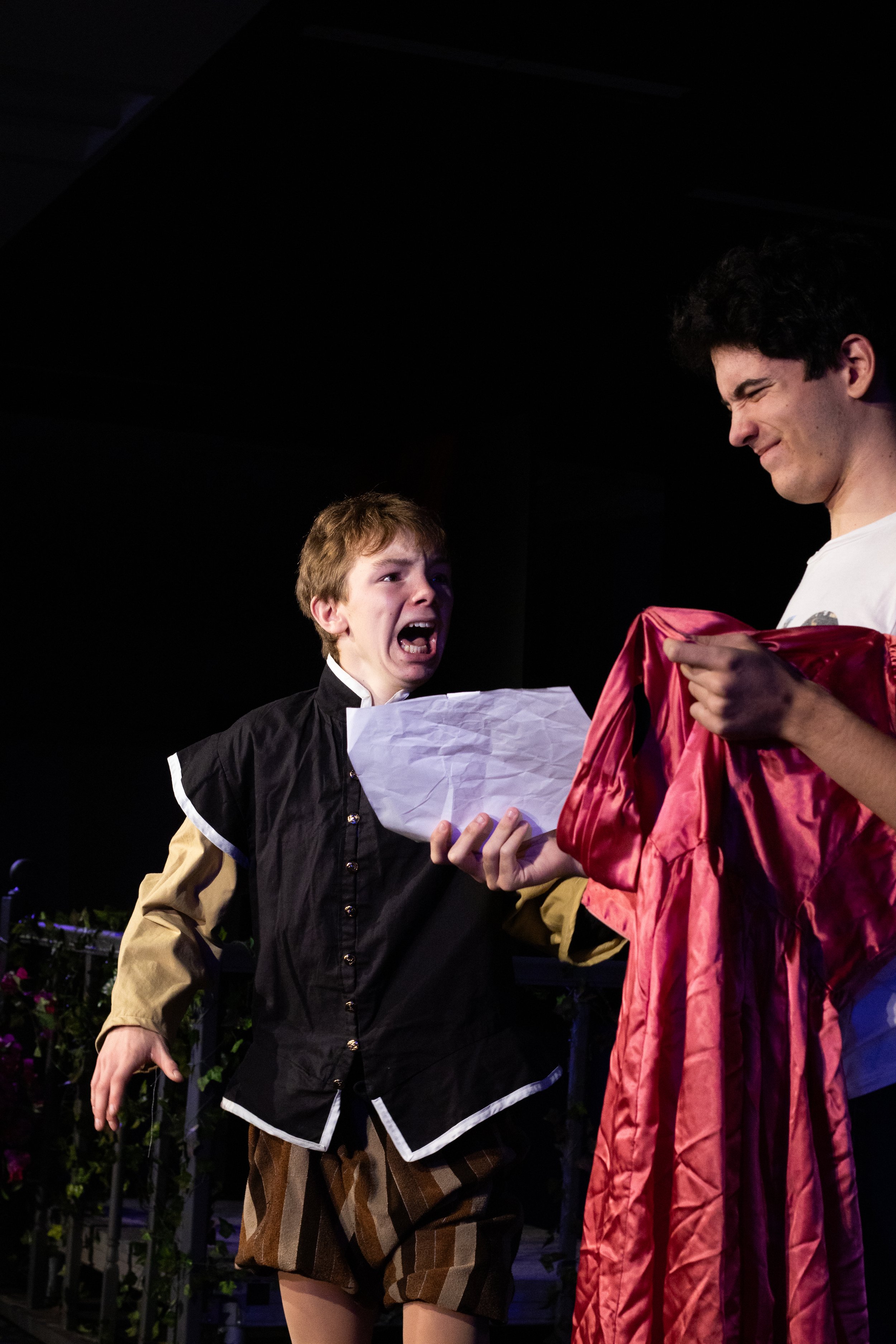
ONE ACT PLAYS
With this production consisting of just two one-act plays, I had the creative freedom to design a distinctive poster that captured the essence of the storytelling. The two plays, The 39 Steps and The One-Act Play Disaster, are brimming with chaos, comedy, and creativity. This design allowed me to blend the suspenseful, murder-mystery feel of The 39 Steps with the wildly chaotic and humorous energy of The One-Act Play Disaster, resulting in a dynamic and
cohesive visual.

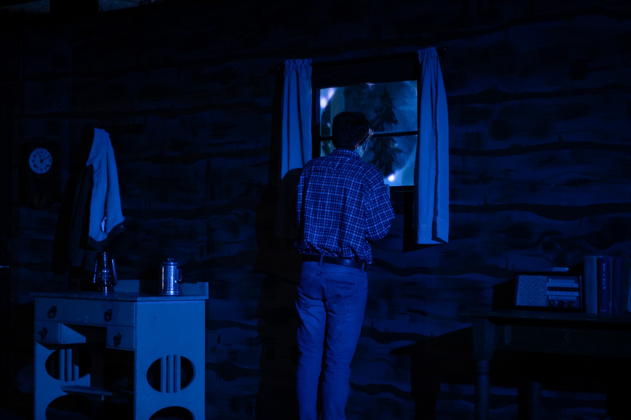
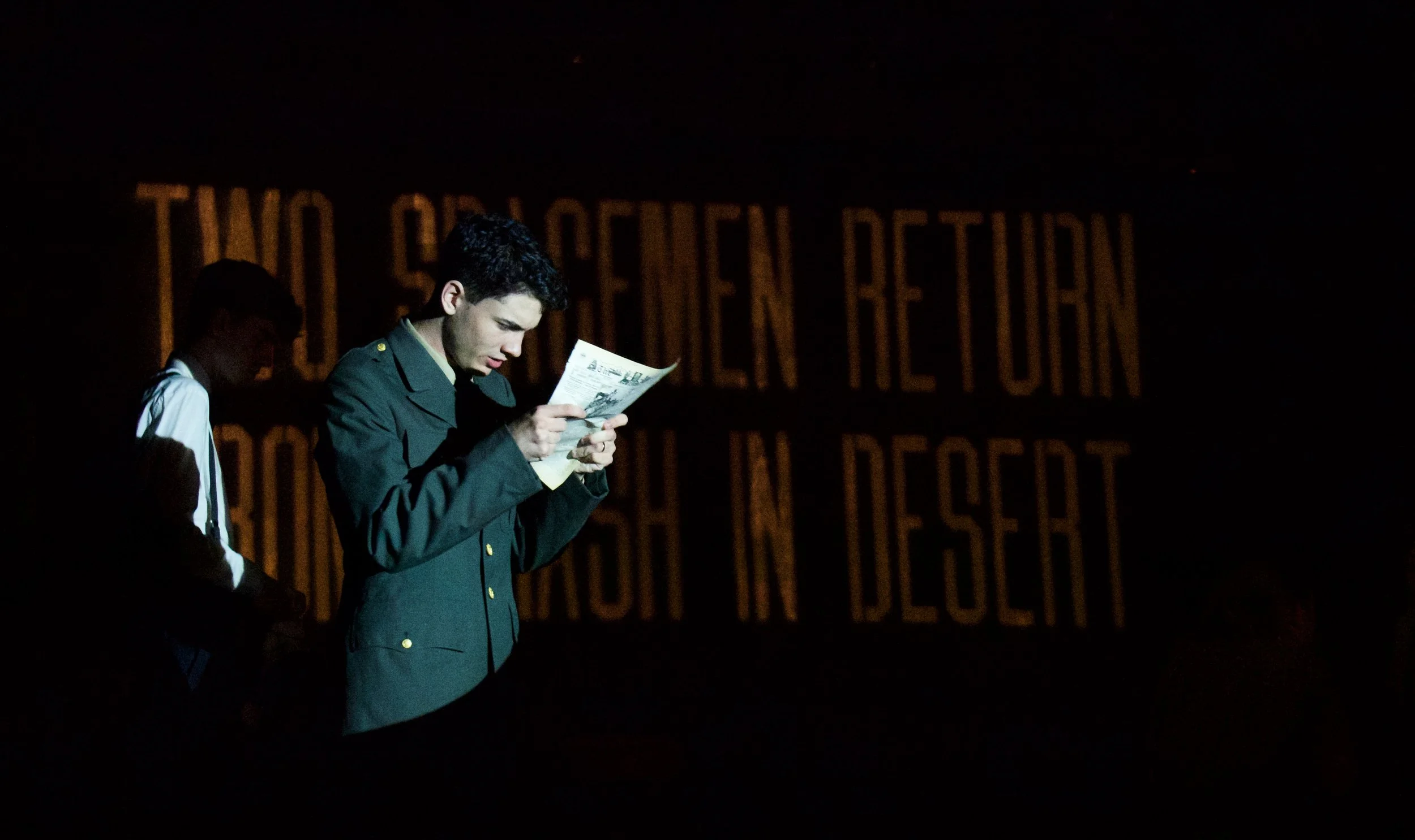
This trio of dramatic one-acts shared a compelling central theme: Out of Time. The first explored a supernatural encounter with a loved one years after their passing. The second depicted a nail-biting climax that unfolds as if it were only a dream. The third delved into the ethical dilemmas of freezing time for personal gain. Inspired by this theme, I created a unique poster that incorporates the intricate inner workings of a clock, visually representing the deeper narrative of time and its mysteries.
Designing the poster for the 2025 Comedic One Acts was such a fun challenge! Each of the three plays had a completely different tone, so creating a cohesive visual theme inspired by vintage TV shows tied everything together perfectly. Projects like this are my favorite — playful concepts that let me explore creative design details, like turning the inside of the playbill into a nostalgic TV Guide layout.
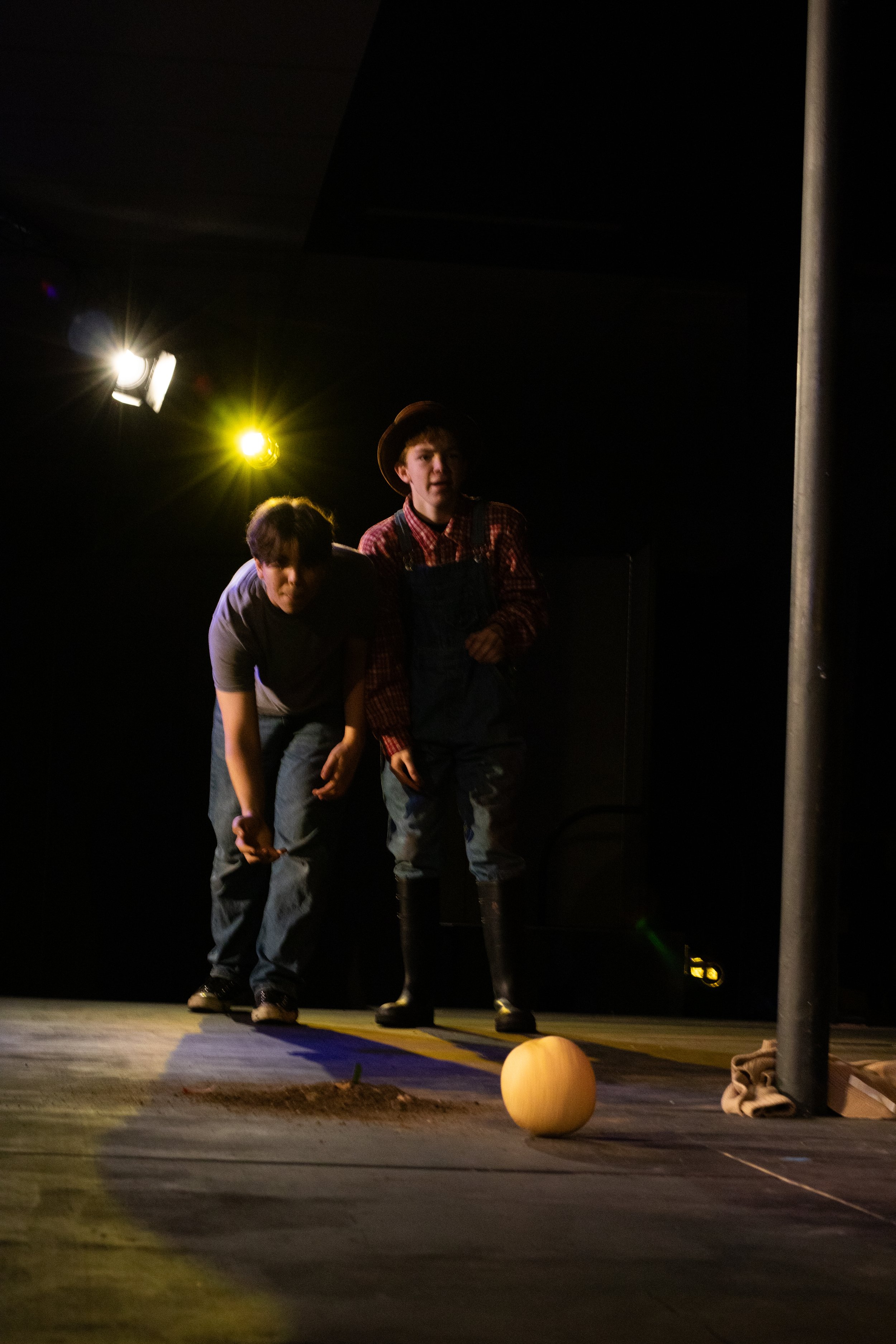
Designing a poster for these three one-act plays, each with distinct and unrelated storylines, was an exciting creative challenge. To embrace their uniqueness, I highlighted key moments and props from each play in the design. This approach sparked curiosity among the audience, adding an element of intrigue—like the cantaloupe featured on the poster, which made perfect sense once they experienced the show.
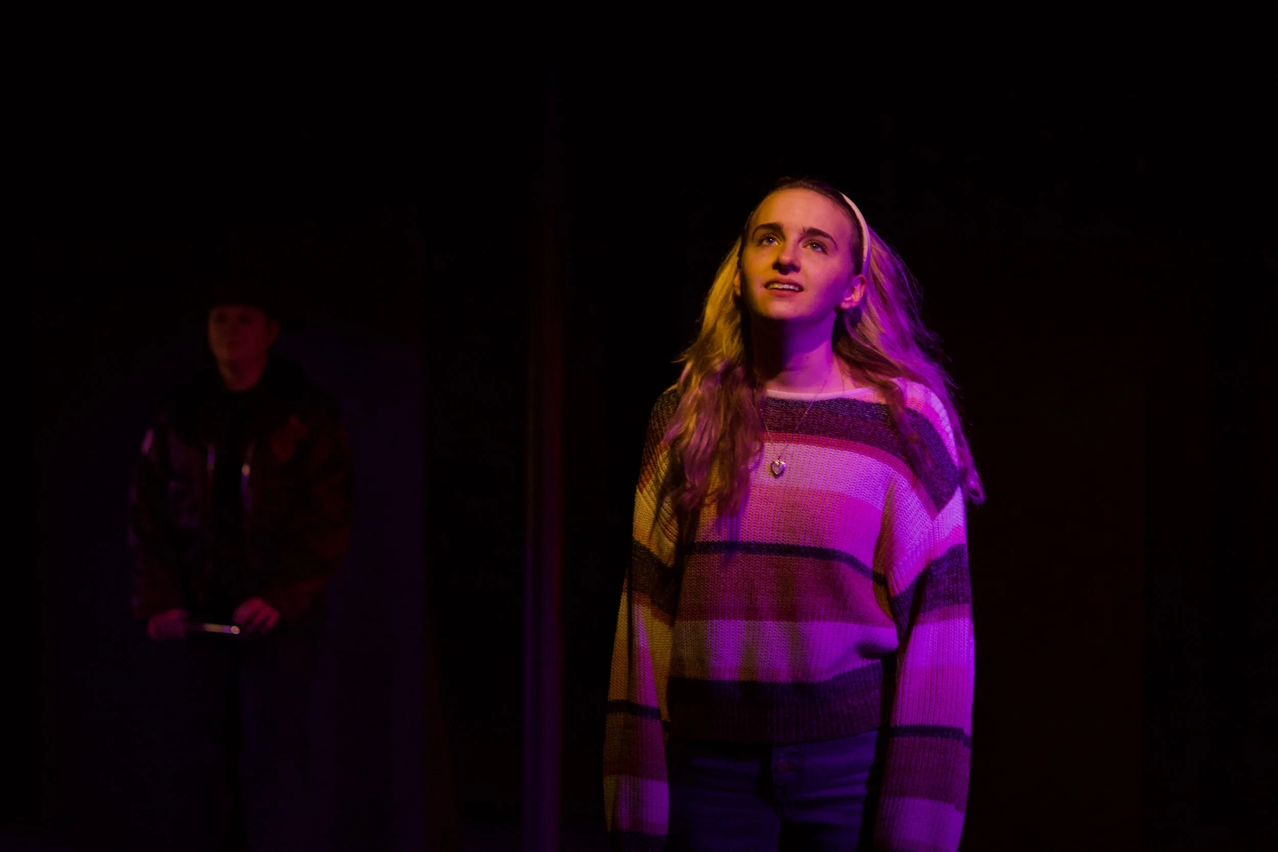
For the poster design of Missing—a trio of one-acts centered on the theme of absence—I aimed to reflect the emotional undercurrent shared by all three pieces. Each story begins in a seemingly normal world, disrupted by a sudden loss of a loved one, family, or hope. I used a rough silhouette of a person to evoke the emptiness of a missing presence, styled loosely after a missing persons poster. Surrounding images connect back to key moments in each story, creating a visual narrative of what’s been lost.
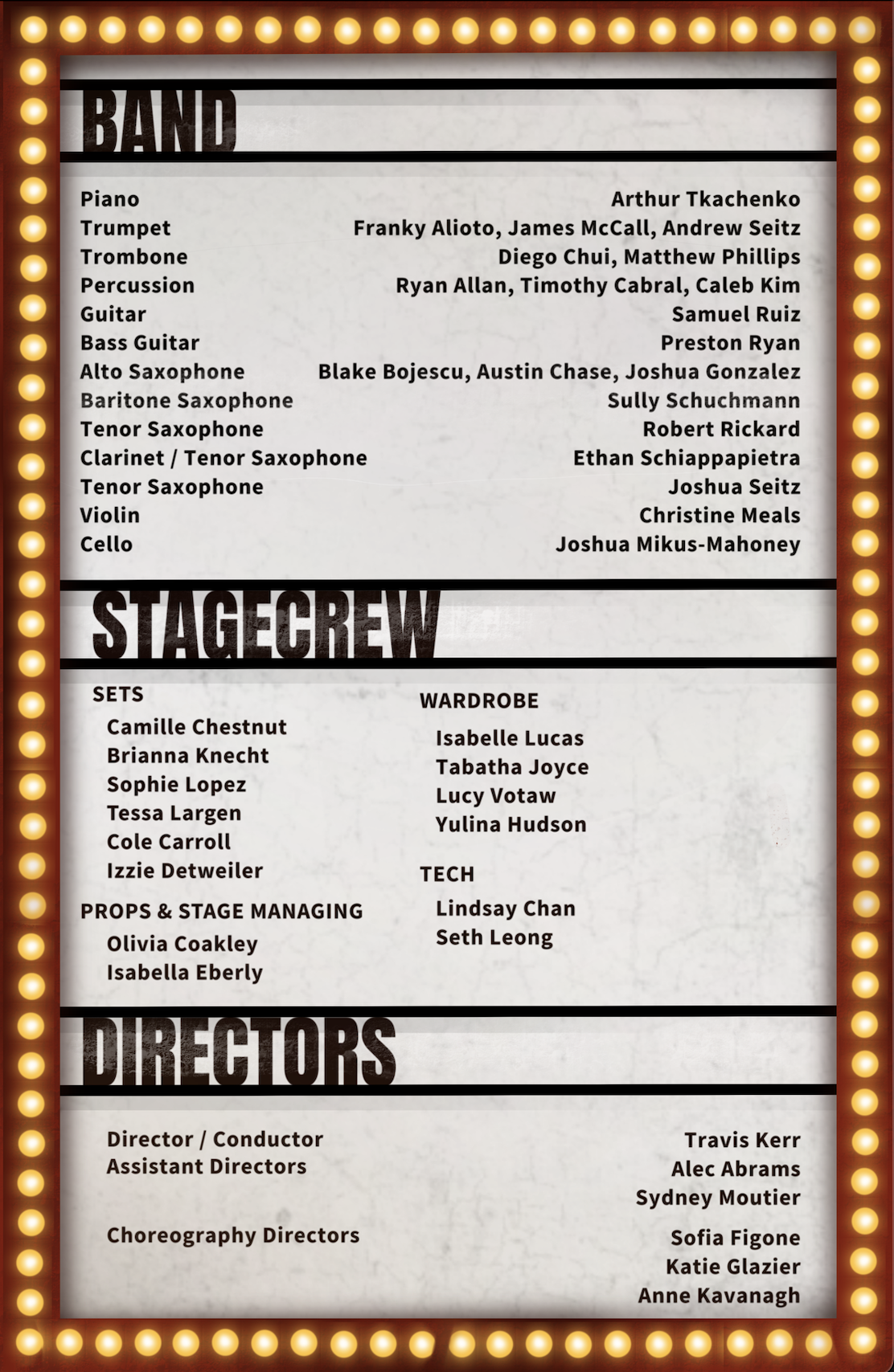
California Baptist University
SCHOOL OF PERFORMING ARTS - WALLACE THEATER


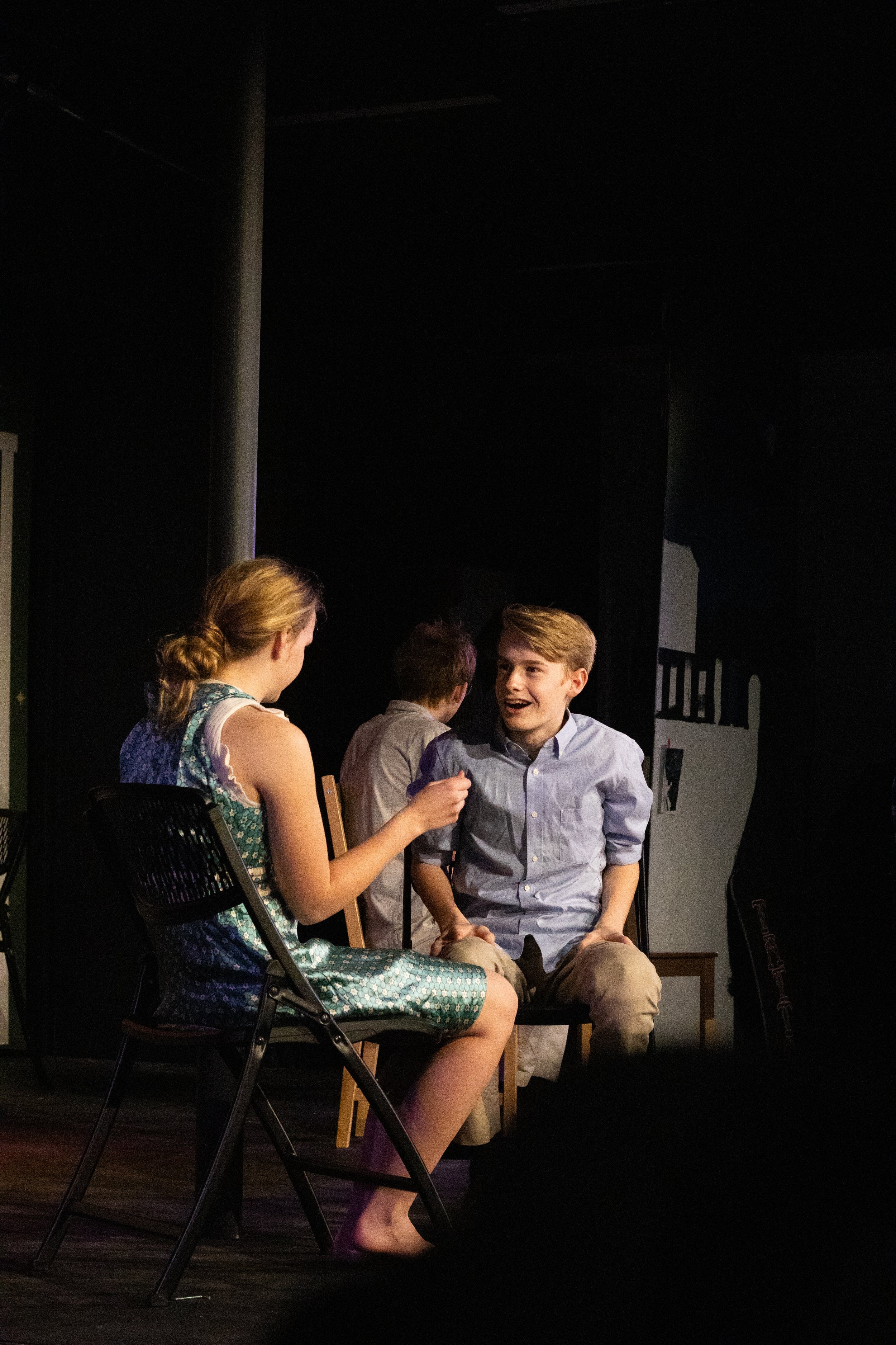
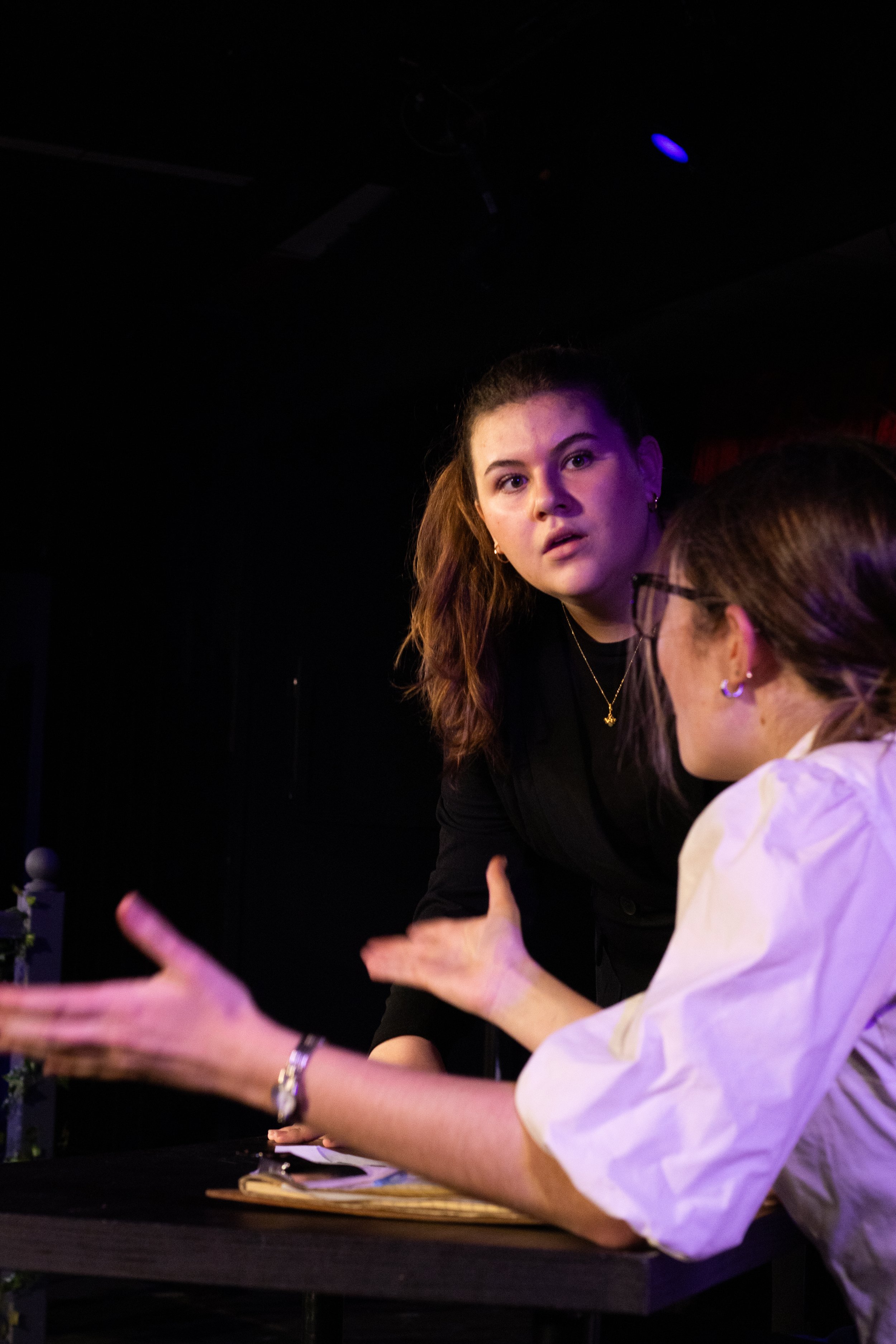
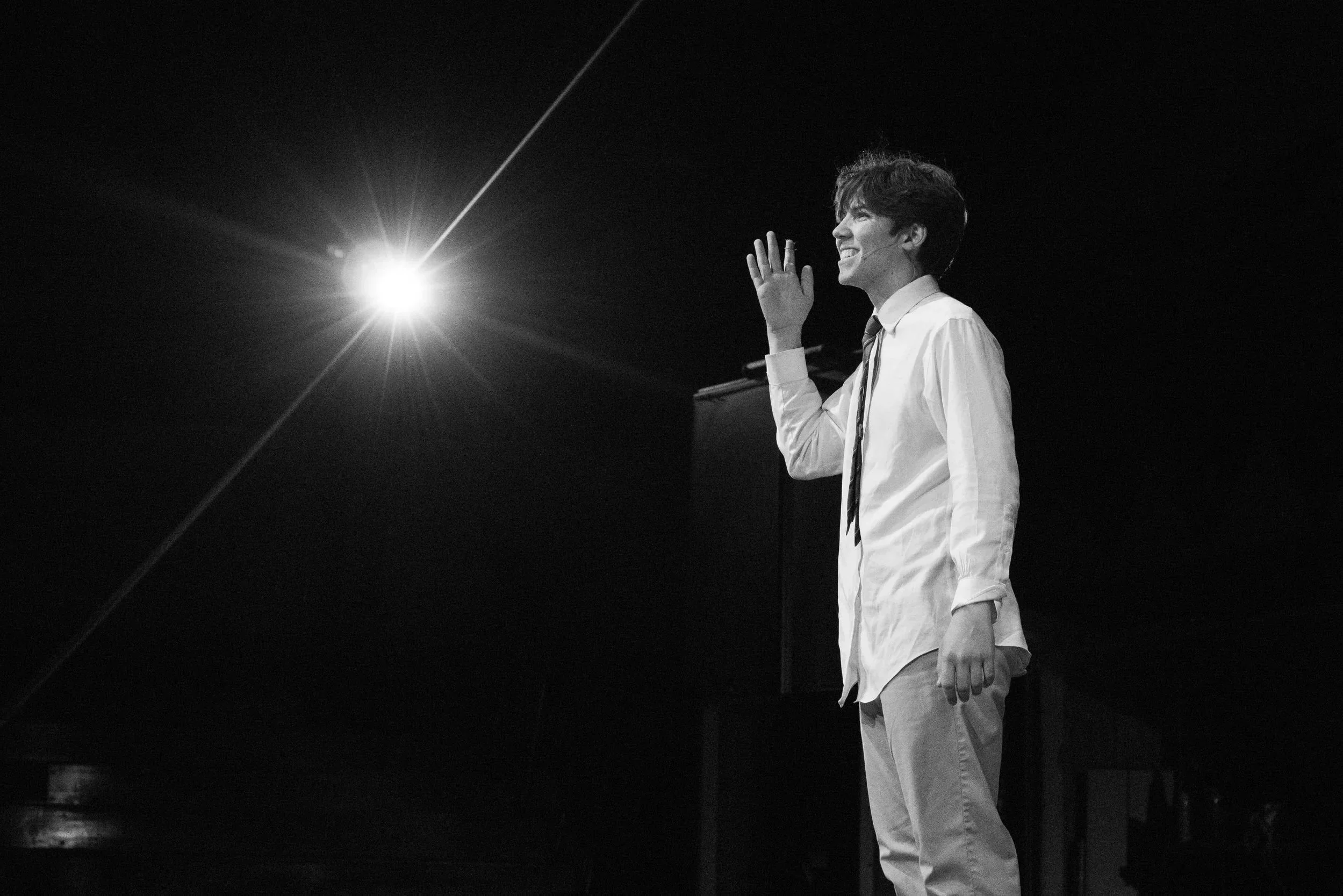
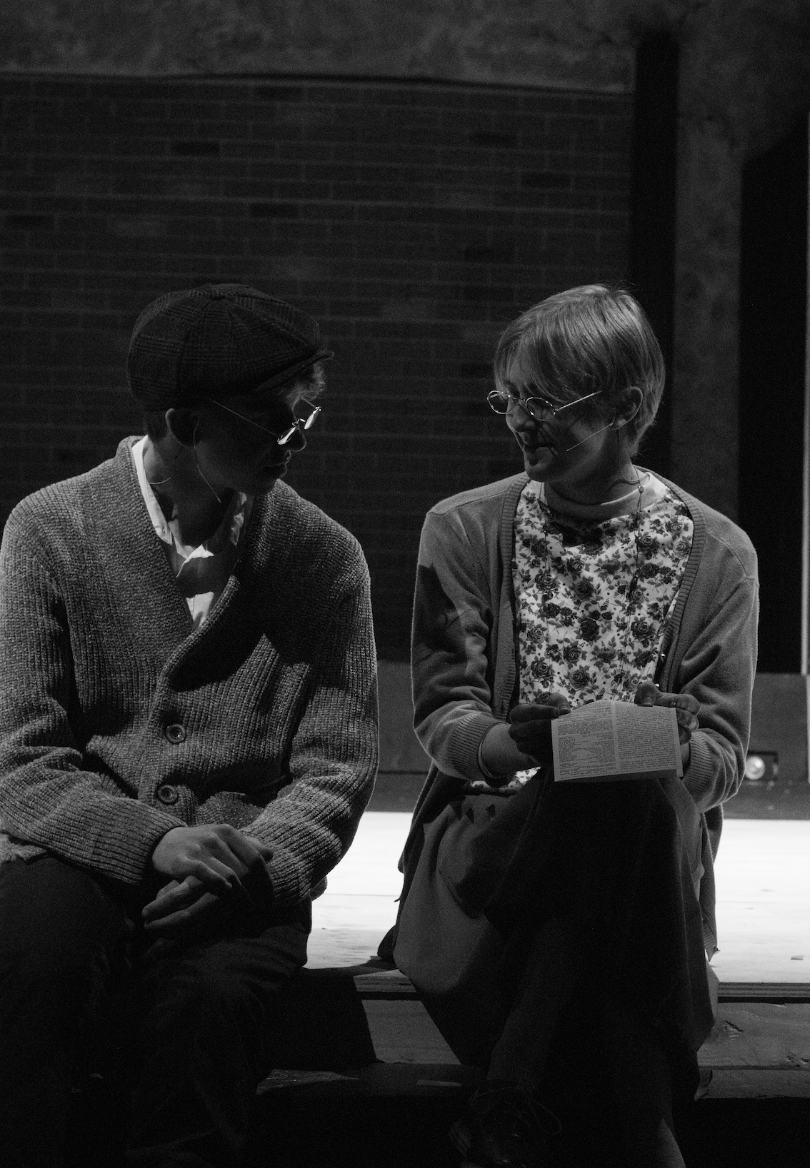
ONE ACTS PHOTOGRAPHED