
Cedar
House
Coop
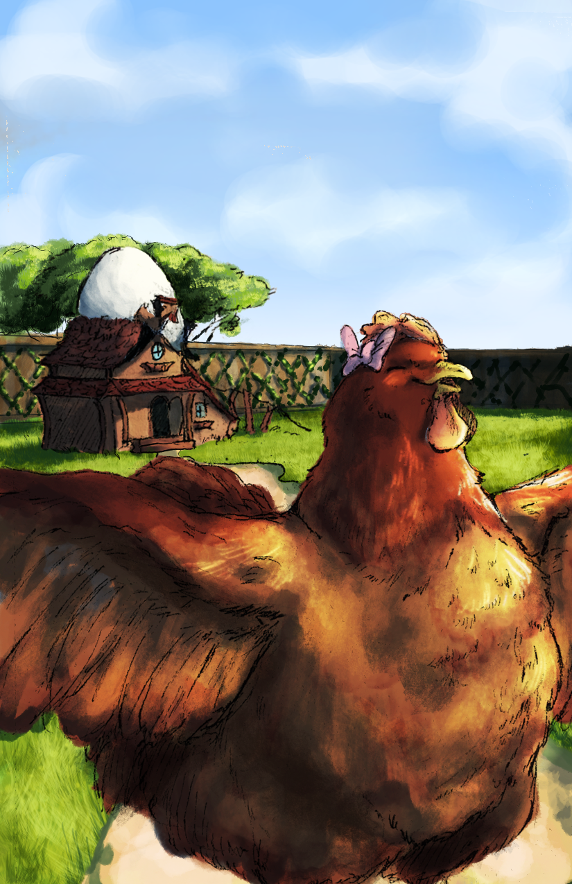
Cedar House Co-op brings stories to life through a world of curious characters, colorful adventures, and childhood imagination. The brand and cover designs were created to feel like an invitation into that world, blending playful illustration, expressive typography, and a sense of discovery that makes you want to open the book and see what’s inside.
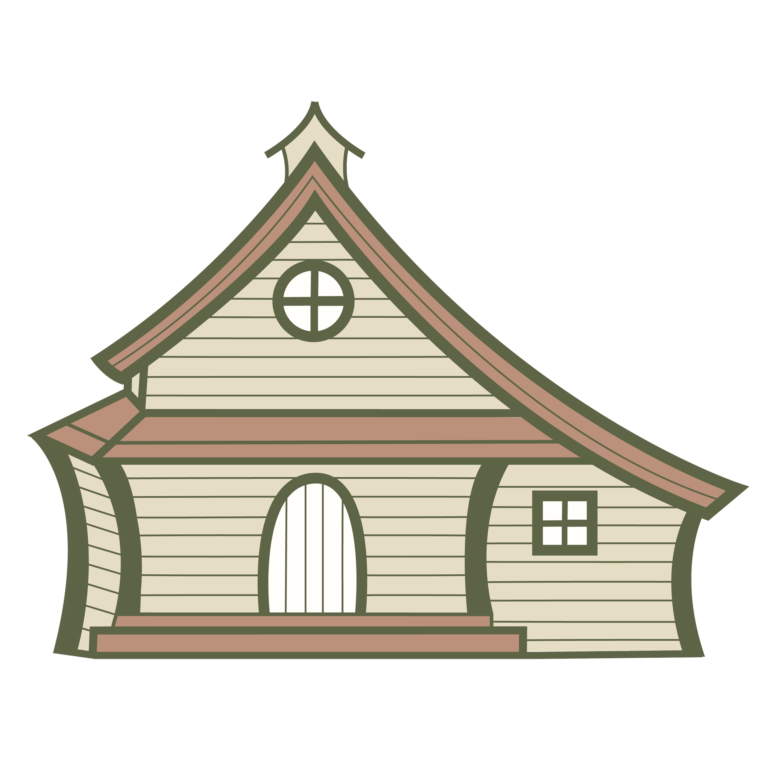
LOGO SUITE

Color Pallette
““Their strategic framework aligned our disparate processes and produced measurable gains within one quarter.””
A warm, earthy palette inspired by the feeling of childhood stories and the natural world. Muted greens, soft terracotta, warm cream, and sandy neutrals create a sense of warmth and imagination while keeping the brand feeling timeless, inviting,
and approachable.