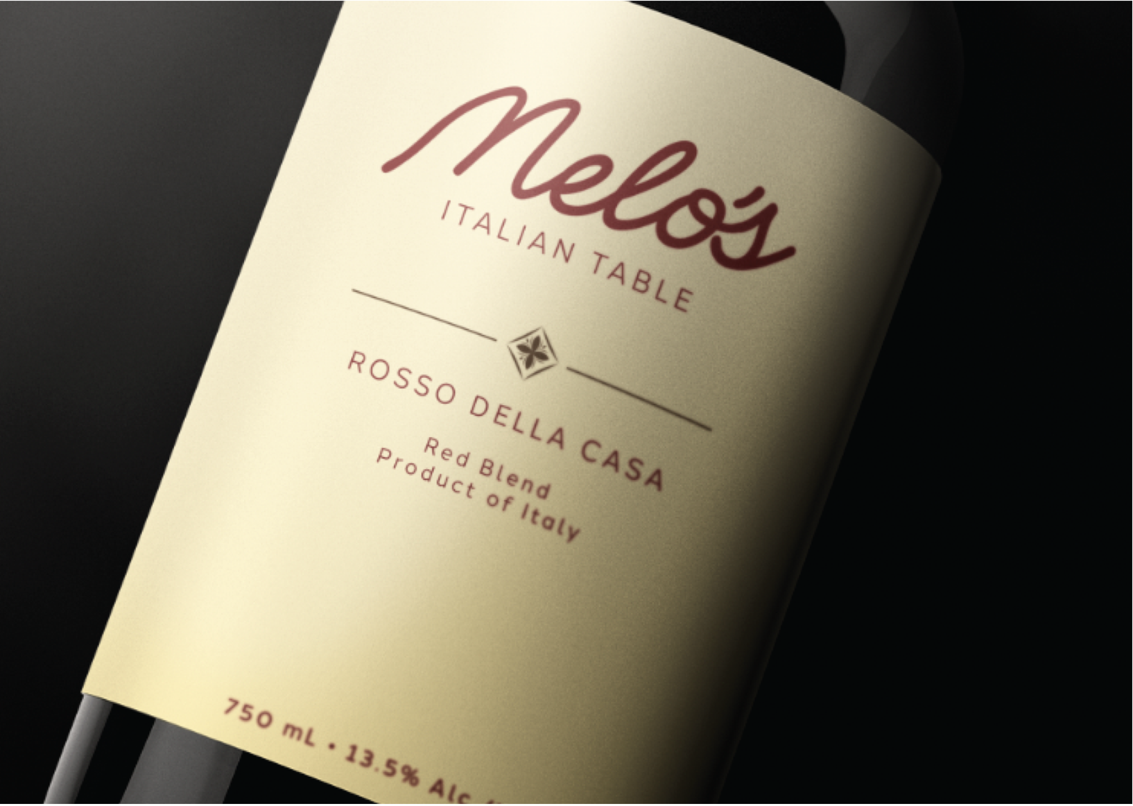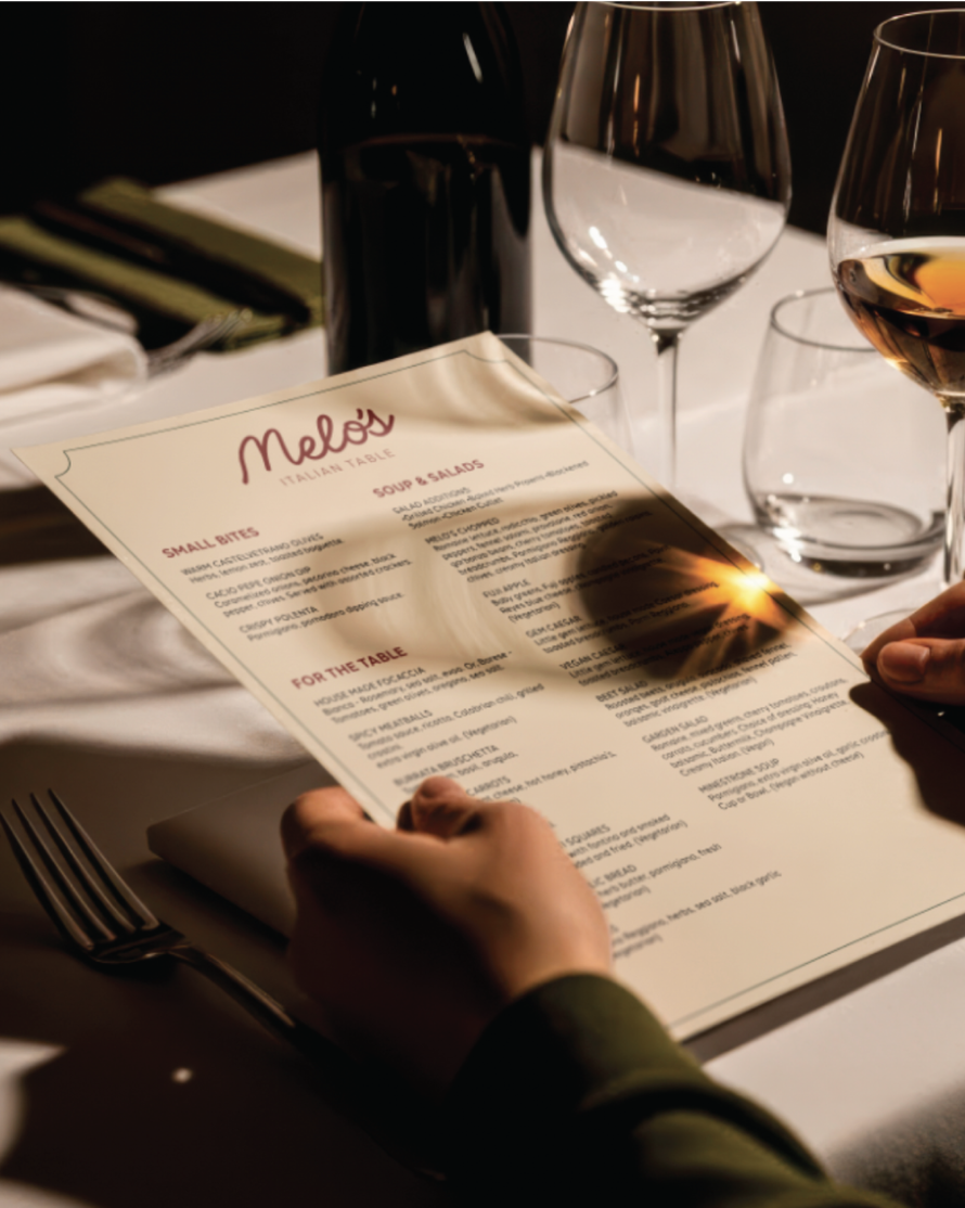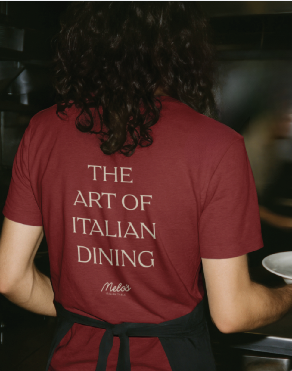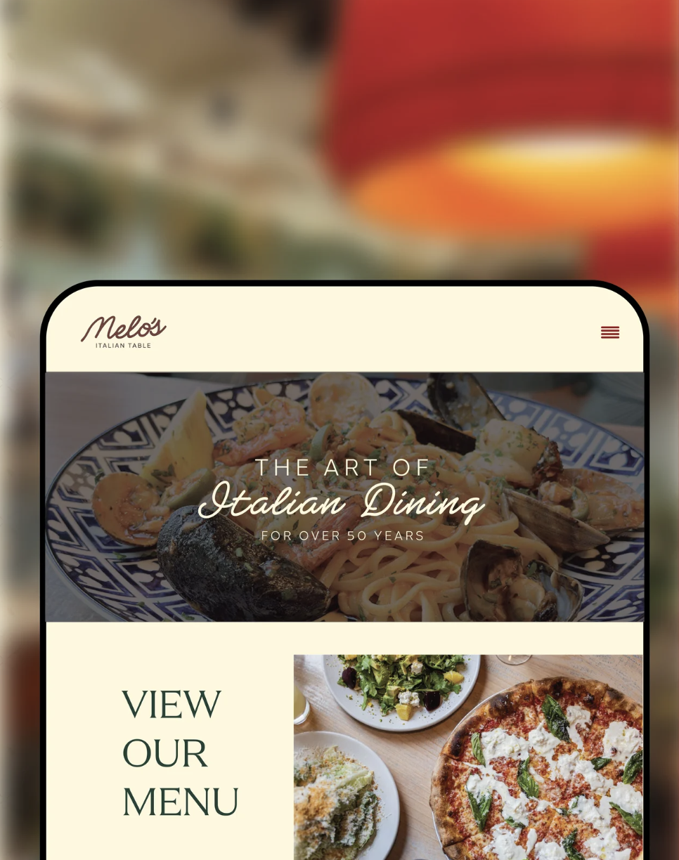
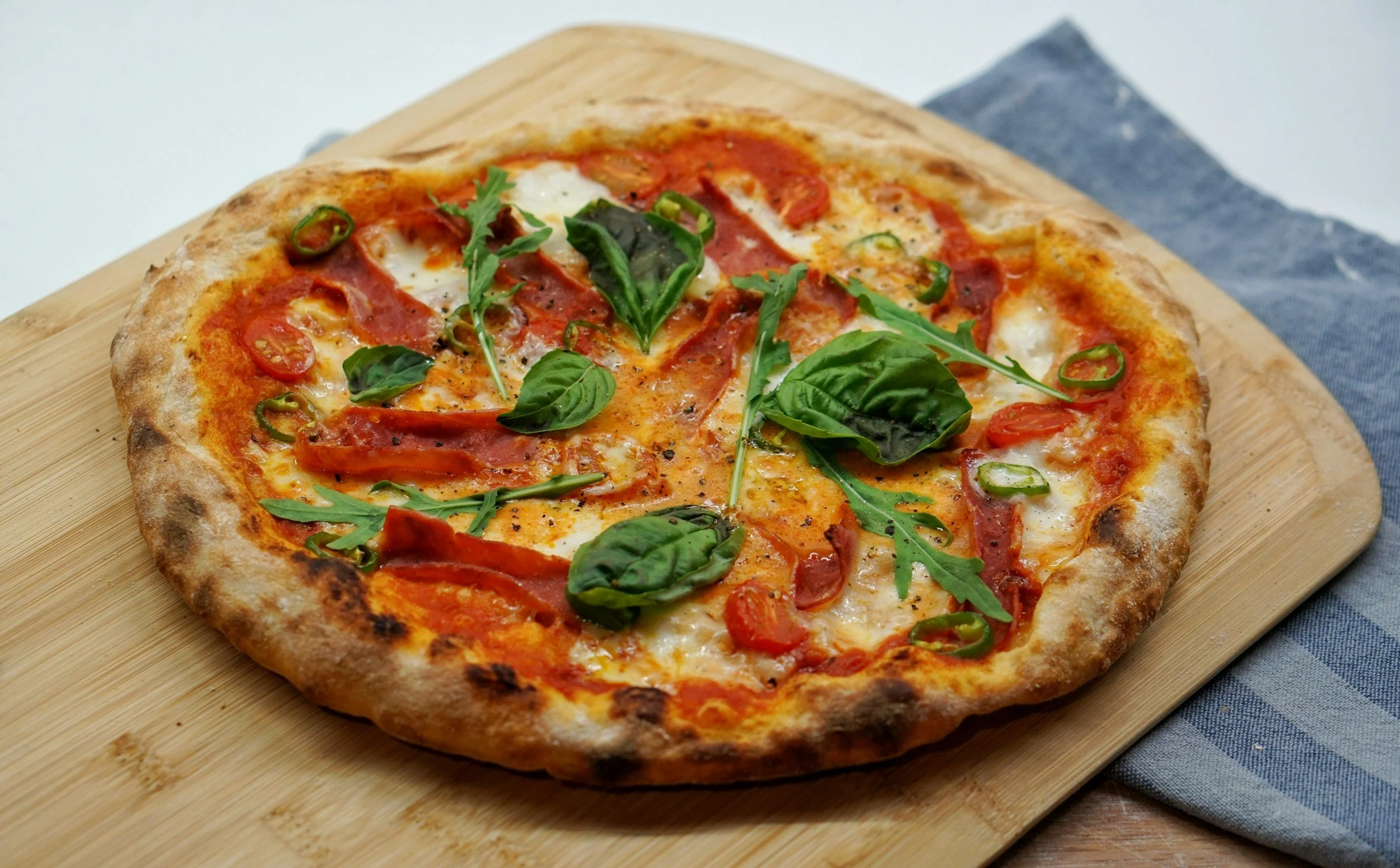
This conceptual redesign explores a refreshed visual identity for a classic Italian restaurant rooted in tradition, hospitality, and family.
The goal was to create a brand system that reflects the quality of the dining experience while bringing a more refined, timeless, and elevated look to the table. This concept honors the warmth and character behind the restaurant while introducing a modern Italian perspective.
MELO’S
LOGO SUITE


COLOR PALLETTE
The color palette chosen for Melo’s rebrand draws from classic Italian shades, creating a sense of warmth, richness, and timeless sophistication. Deep, earthy tones are paired with refined neutrals to reflect the restaurant’s elevated taste while still feeling inviting and approachable. Together, the palette captures the warmth of Italian dining with a modern, carefully considered aesthetic.